Over the past few years, I’ve really transitioned to working digitally over traditionally. The switch happened slowly at first: I would still pencil and ink everything traditionally but scan it and then colour in Photoshop. But when the response of the Apple Pencil on the iPad started to feel almost exactly like using a regular pencil and I discovered the app Procreate (plus factoring in the ease of being able to create work on the go, anywhere, with just one tablet and one pen), I couldn’t resist the lure of digital.
A character with one prosthetic leg, wearing a tank top and shorts, standing in a welcoming position.
One of the things I've discovered when drawing digitally is that I've been able to experiment more with my art, without freaking out that I’m going to ruin everything. When working traditionally, the permanentness of using pens, textas, or paints can sometimes almost make me freeze (particularly when my perfectionism comes into play). But the flexibility of working digitally (sure, being able to undo is nice, but also to be able to copy, stretch and rearrange things easily) has really opened up a lot of options for the work I create. I can practice pushing my characters’ poses or getting that emotion exactly right on their face or try different colour combinations without worrying that if I commit to one and it doesn’t turn out okay, I’ll have to re-draw the whole image to practice it.
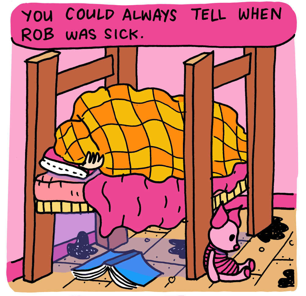
A character in full shadow wearing a woollen jumper and patched jeans holds their hand up to their eyes and is looking at something far away.
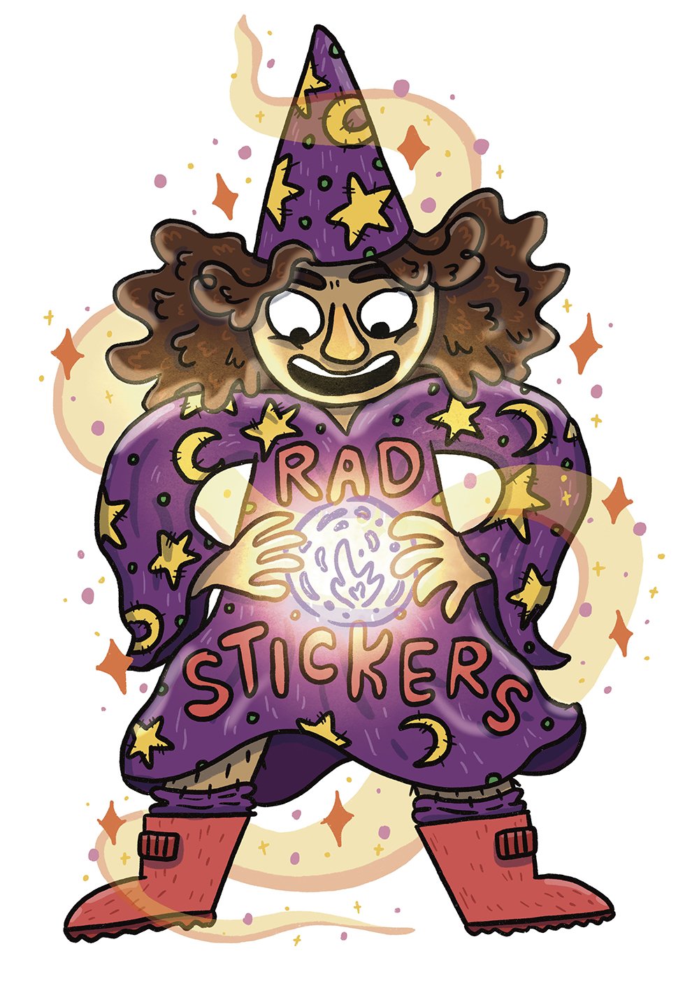
Working with light and shadow is something in particular that I’ve really gotten into playing around with when drawing on my iPad. Usually my drawings use simple clean lines with flat colours, but I’ve really enjoyed starting using coloured lines for textures ( e.g. in clothes, hair) as well as adding shadows to create a bit more depth to the flat images. More recently I’ve started playing around with adding highlights too - I’m still a while away from feeling like I’ve got a handle on those but it’s coming along.
A wizard in a purple robe covered in yellow stars and moons is holding a glowing orb and has a magical aura around them.
Full colour illustration of 5 roller derby players in roller skates and safety gear posing together looking tough and confident.
One of my favourite things about working digitally are the accidents that turn out to be really interesting and get me thinking about how I could colour in a different way. For example, I drew a collection of fictional roller derby players and coloured them as I normally would - natural, flat colours, add some shading for depth and then highlights to help create a sense of roundness in the characters. At one point I’d switched to the wrong layer and when I went to drop some colour into one of the characters I accidentally just blocked out all of the characters in this salmon pink colour. Initially I was all “Gah! Silly me!” Wrong layer!” but looking at the result I really loved how it turned out. It opened up my brain to thinking about how I could be using colour differently when making comics. I’m keen to see what a full comic of block colours might look like.
Pink & purple illustration of 5 roller derby players in roller skates and safety gear posing together looking tough and confident.
I still love working traditionally (I don't think anything will ever quite beat the scratch of pen on paper) but I think that working digitally has really helped me grow as an artist and refine my skills, so whenever I jump back to working traditionally (or try out mediums I’ve never used much, like watercolours or colour pencil or stamp carving), I feel more confident about giving things a go (and not worrying about whether they turn out exactly right).


Following on from my last post about how the design of the characters in my graphic novel, Oh Brother, have changed over the 7-ish years I’ve been working on the book, this post is about my absolute favourite thing: drawing emotions!