A while back I rediscovered a heap of ink wash pens I’d made back when I thought I would really get into using brushes and ink. I’d decided to start off with brush pens instead of jumping straight into using regular brushes (which seemed tricky and impossible, and still does a bit!). I took three refillable reservoir watercolour brush pens and filled each of them with varying ratios of ink. One pen was mostly water with just a bit of ink, another pen was 50/50 water/ink and the final pen was all ink.
Three brush pens with refillable reservoirs. Each pen has slightly darker ink than the one before.
I tried them out for a bit but at the time I don’t think I really liked the messy line I was making (after exclusively using fineliners my entire illustrative life) and couldn’t push through the uncomfortable perfectionist talk my brain was giving me, so I gave up on that inky brush dream. Recently, however, having used a bit more watercolour, I was curious about trying these out again, but treating them more like shading tools (and keeping those strong fineliner lines I feel confident with. Baby steps!). I mostly used the first two brush pens (the one that is mostly water and the 50/50 one). But I wanted to make sure that the scene I was drawing felt like it should be in B&W, so of course I landed with a fairy private detective in a film noir-style setting. Here are the steps I took to create this piece:
Step 1: Sketch it out
Using whatever scrap paper I had lying around, I sketched out the design loosely. As I wanted to practice my perspective (my nemesis) as well as using only shades of grey instead of colour, I had to draw this scene a few times to get it as close as I could to what I wanted. I was struggling to decide if I wanted it to be in isometric perspective or a more real perspective. I feel like I kinda landed somewhere in between.
Step 1: A rough pen sketch of a pixie sitting in a private detective’s office. The detective is a fairy.
Step 2: Pencil and Ink
Now that I’d come up with a game plan, I popped over to our light table and, on a fresh piece of paper, pencilled out the scene again (using the sketch underneath for a guide). I then turned off the light table and inked the pencilled drawing. You can see where I’ve (not particularly successfully) tried to start marking in where I think the light might fall.
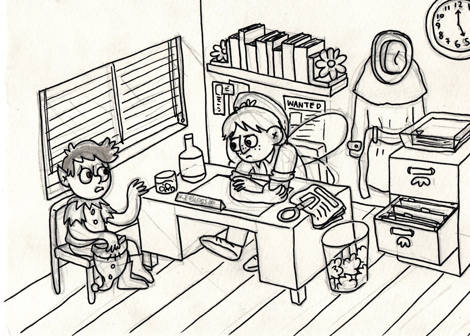
Step 2: A tight drawing of the pixie and the detective fairy. You can see some lead pencil marks under the clean simple inked line work.
Step 3: Final Inks and Ink Wash
I wasn’t super happy with how I inked the scene the first time, so I actually inked it again on a fresh piece of paper (getting out the light table again and using the pencil/inked drawing for the guide this time). If you look closely at Step 2 and 3 you can spot the minor differences in the line work (and some things that are missing!).
Once inked (with a fineliner), I erased the pencils and added in the shading with the ink wash brushes. As someone who generally just block colours everything, it was an interesting experience figuring out what to colour in and what to leave as a highlight.
Step 3: The same scene of the pixie and detective fairy but now it also has ink wash added to give depth, shading and indicate where the light source is coming from.
Although the line work is still a bit wonky, the perspective isn’t perfect and the lighting is…fine, I’m pretty happy with how this turned out in the end. I particularly loved the texture in the picture that came from using paper with more of a rough tooth (I usually use the smoothest of paper as I hate the feeling of my fineliners on a rough paper).
Anyway, that’s it! I really enjoyed working in greyscale and it really highlighted to me how little I know about shading and light. Lots to practice! I would love to do more ink wash and refine those skills for sure. Maybe I should make a whole comic about this fairy detective (or at least paint some keys scenes from a possible story a fairy detective might go through)?


Following on from my last post about how the design of the characters in my graphic novel, Oh Brother, have changed over the 7-ish years I’ve been working on the book, this post is about my absolute favourite thing: drawing emotions!