Drawing Buddies - January Challenge


Above: Roof Rat by George Rex based on Jake Holmes’s Roof Rat.

Above left: Roof Rat by Jake Holmes. Based on the Highway Rat by Julia Donaldson, illustrated by Axel Scheffler.

Above right: The Highway Rat by Axel Scheffler.

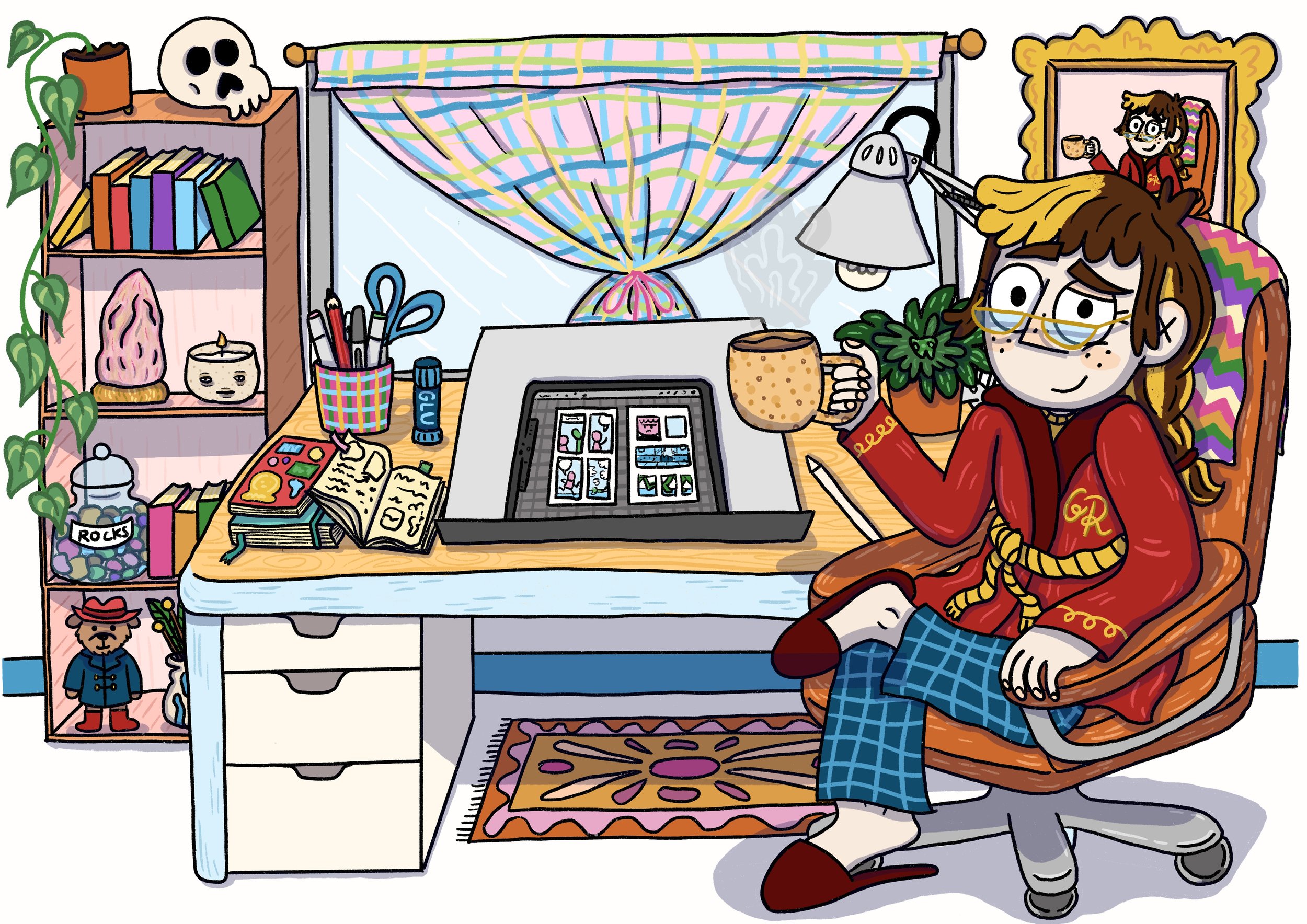
This year my screenprinter & illustrator pal Jake Holmes (jaketoothandnail on instagram) and I have decided to be drawing buddies. Each month we will take turns to decide on a drawing challenge that we will both undertake over the course of the month. Jake already has his own goal of drawing for at least 30 minutes every day, which he’s been doing for the past couple of years, and I’m trying to do that too this year (that’s 30 minutes of ‘free’ drawing, on top of my Oh Brother work!). The monthly drawing challenges we come up with are more to help us have a guideline of something to draw, if we’re ever stuck for ideas. I’m hoping to use these drawing prompts to challenge my skills, particularly in areas that I’m weakest (perspective, adding backgrounds, light and shadow, pushing poses to be even more animated).

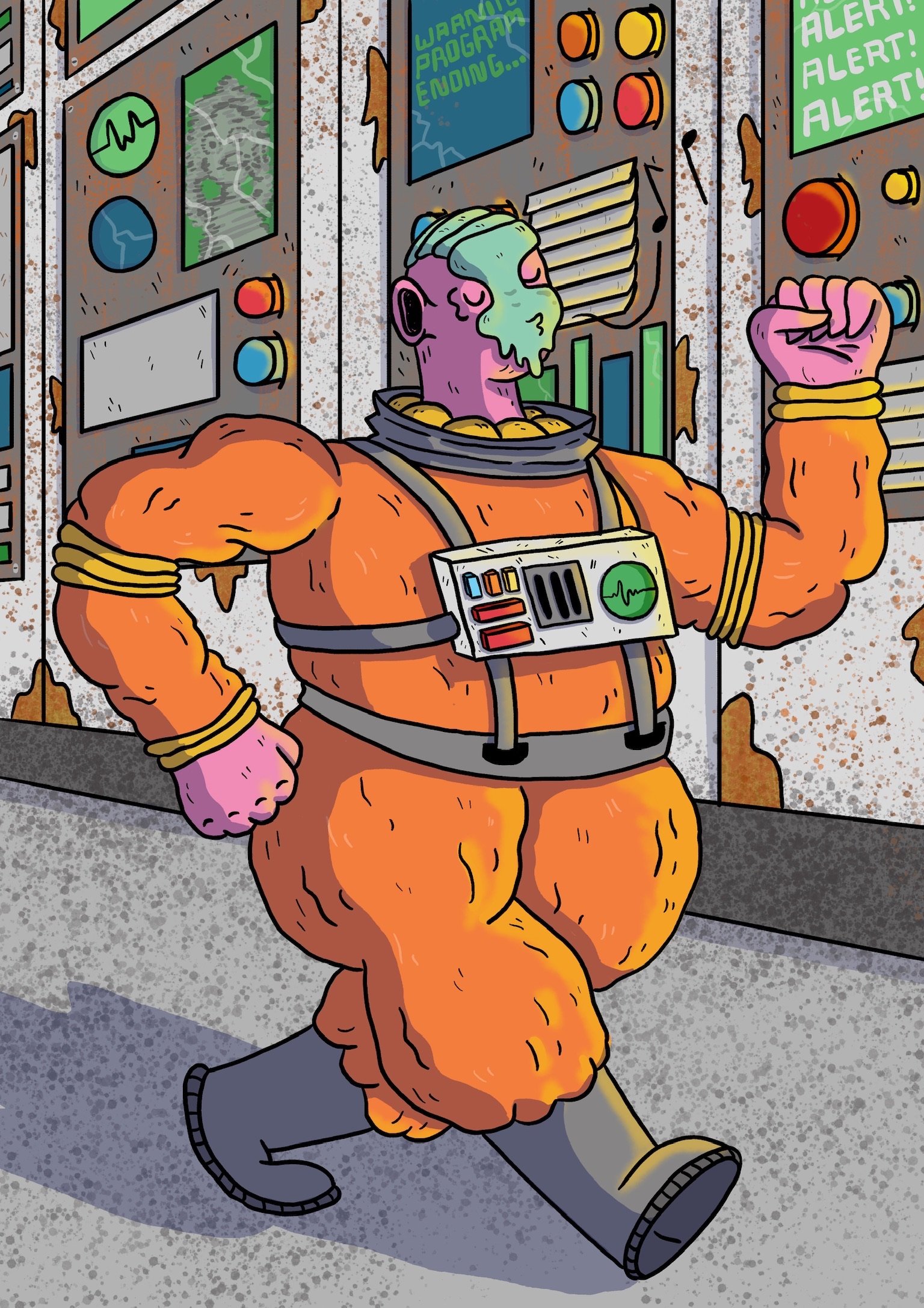
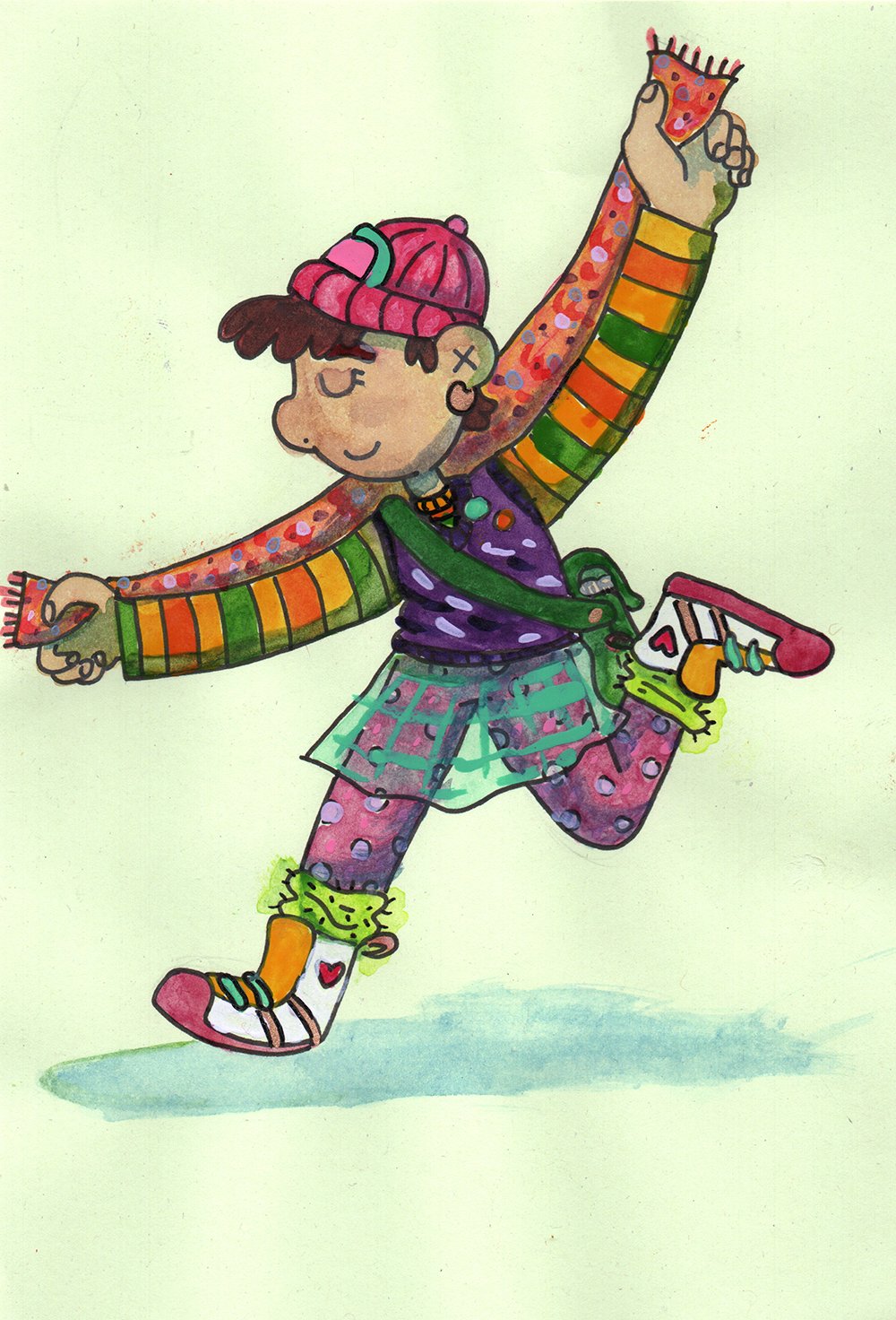
Above left: Jaunty Space Man by George Rex based on Jake Holmes’s illustration “Homecoming”.

Above right: Jake Holmes’s original illustration “Homecoming”.

The January challenge was set by Jake. It was simple: we scroll through each other’s instagram account, pick some characters that the other had already drawn & posted, and then redraw the characters in our own style. My aim was to do one a week throughout January. I tried to pick a range of different characters and then push their poses and add backgrounds (if they didn’t have them already).

Above left: Tina Papanikolas by George Rex, watercolour illustration.

Above right: Tina Papanikolas by Jake Holmes, based on watercolour illustration by George Rex.

Jake ended up drawing a version of one my favourite characters I’ve created in the past few years, Tina Papanikolas, who (along with her new best friend Tori) solves mysteries and crimes happening in their neighbourhood. I love Jake’s version of Tina, particularly how he captures her cool mesh skirt (I get to live out all my fashion dreams through Tina). My version of Tina that Jake based his off is one of the few watercolour illustrations I did last year, when I was trying to get a handle on different mediums.

I really like how Jake uses light and shade to bring his characters to life, and redrawing his characters this month has really pushed me to think about how I use light (or don’t) in my illustration and comics.

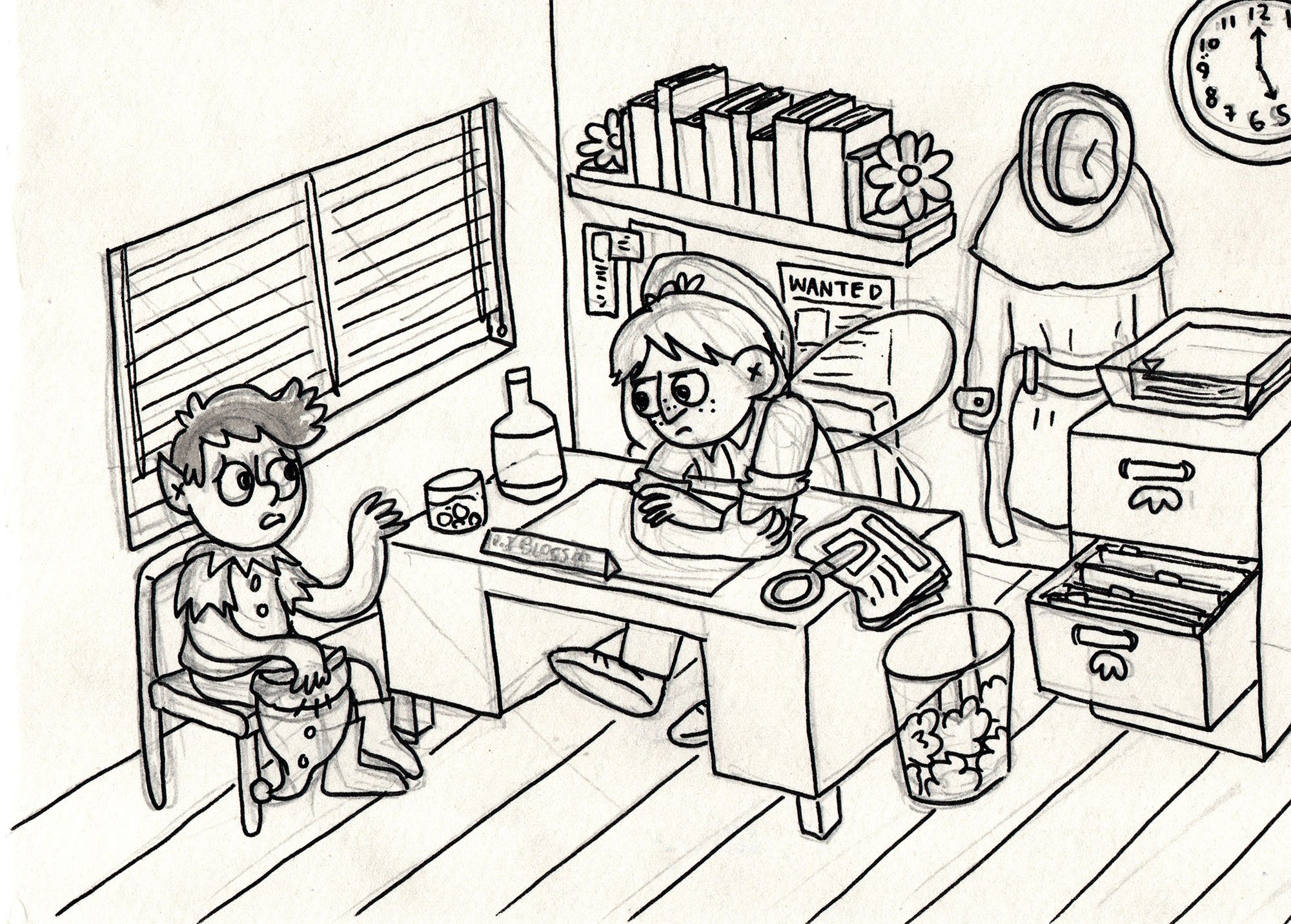
Above left: The Gang by George Rex based on Jake Holmes’s cool teens illustration.

Above right: Jake Holmes’s original illustration of three cool teens.

These Jake characters were the most like ones I would normally draw and I had a lot of fun trying to show their personalities through their poses. When I showed Jake my version, he said that he’d been inspired by how I draw characters when creating the original drawings. I thought that was pretty neat.

I had a ton of fun redrawing Jake’s characters and it was a great way to get into the habit of drawing every day, because I knew when I sat down to draw that I didn’t have to think about what to draw, I just had to have a quick scroll through Jake’s instagram and get inspired. So far this year I’ve managed to draw every day for at least half an hour and it feels really good!

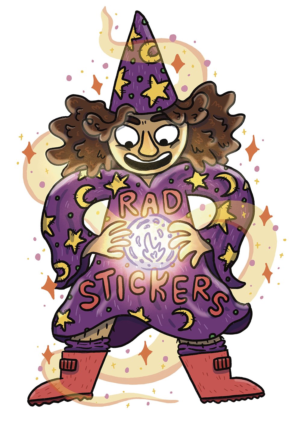
Above left: Cheese Wizard by George Rex based on Jake Holmes’s Cheese Wizard illustration.

Above right: Cheese Wizard by Jake Holmes. Jake originally drew this character based on a prompt by me!

It’s been really interesting drawing so much that I notice little habits of mine, like how I generally love my pencil sketch but then hate the inked version (and the flat colours even more). But when I start adding in shading (and highlights) or textures, it all starts coming together. When it’s just inks and flats, it looks okay but it’s kinda like looking at a haircut halfway through, it’s almost there but it hasn’t got that pizzazz of a final drawing.

It’s my choice for our February drawing challenge but I haven’t decided what it will be yet. But I’m looking forward to it and seeing what we both come up with (it’s always more fun to do a drawing challenge with a buddy, it definitely helps to keep me more motivated).

Noodling around with ink wash


A while back I rediscovered a heap of ink wash pens I’d made back when I thought I would really get into using brushes and ink. I’d decided to start off with brush pens instead of jumping straight into using regular brushes (which seemed tricky and impossible, and still does a bit!). I took three refillable reservoir watercolour brush pens and filled each of them with varying ratios of ink. One pen was mostly water with just a bit of ink, another pen was 50/50 water/ink and the final pen was all ink.

Three brush pens with refillable reservoirs. Each pen has slightly darker ink than the one before.

I tried them out for a bit but at the time I don’t think I really liked the messy line I was making (after exclusively using fineliners my entire illustrative life) and couldn’t push through the uncomfortable perfectionist talk my brain was giving me, so I gave up on that inky brush dream. Recently, however, having used a bit more watercolour, I was curious about trying these out again, but treating them more like shading tools (and keeping those strong fineliner lines I feel confident with. Baby steps!). I mostly used the first two brush pens (the one that is mostly water and the 50/50 one). But I wanted to make sure that the scene I was drawing felt like it should be in B&W, so of course I landed with a fairy private detective in a film noir-style setting. Here are the steps I took to create this piece:

Step 1: Sketch it out

Using whatever scrap paper I had lying around, I sketched out the design loosely. As I wanted to practice my perspective (my nemesis) as well as using only shades of grey instead of colour, I had to draw this scene a few times to get it as close as I could to what I wanted. I was struggling to decide if I wanted it to be in isometric perspective or a more real perspective. I feel like I kinda landed somewhere in between.

Step 1: A rough pen sketch of a pixie sitting in a private detective’s office. The detective is a fairy.

Step 2: Pencil and Ink

Now that I’d come up with a game plan, I popped over to our light table and, on a fresh piece of paper, pencilled out the scene again (using the sketch underneath for a guide). I then turned off the light table and inked the pencilled drawing. You can see where I’ve (not particularly successfully) tried to start marking in where I think the light might fall.

Step 2: A tight drawing of the pixie and the detective fairy. You can see some lead pencil marks under the clean simple inked line work.

Step 3: Final Inks and Ink Wash

I wasn’t super happy with how I inked the scene the first time, so I actually inked it again on a fresh piece of paper (getting out the light table again and using the pencil/inked drawing for the guide this time). If you look closely at Step 2 and 3 you can spot the minor differences in the line work (and some things that are missing!).

Once inked (with a fineliner), I erased the pencils and added in the shading with the ink wash brushes. As someone who generally just block colours everything, it was an interesting experience figuring out what to colour in and what to leave as a highlight.

Step 3: The same scene of the pixie and detective fairy but now it also has ink wash added to give depth, shading and indicate where the light source is coming from.

Although the line work is still a bit wonky, the perspective isn’t perfect and the lighting is…fine, I’m pretty happy with how this turned out in the end. I particularly loved the texture in the picture that came from using paper with more of a rough tooth (I usually use the smoothest of paper as I hate the feeling of my fineliners on a rough paper).

Anyway, that’s it! I really enjoyed working in greyscale and it really highlighted to me how little I know about shading and light. Lots to practice! I would love to do more ink wash and refine those skills for sure. Maybe I should make a whole comic about this fairy detective (or at least paint some keys scenes from a possible story a fairy detective might go through)?

Experimenting with Watercolour


New BFFs Tina and Tori sit in their pyjamas, eating lollipops and reading comics on Tina’s bedroom floor.

I know that my last post was all about how I’ve been slowly moving towards working entirely digitally (which is really useful when working with clients and editors and I’m having to make lots of tweaks and changes on a project), but I think working so much on my iPad for work-based illustration and comics has pushed me into wanting to try out different mediums when making fun illustrations for myself. In particular, I’ve really been keen to get into watercolour.

Tina is wearing her favourite clothes that make her happy, showing off her multicoloured scarf and green tile skirt.

I’ve tried delving into watercolour a few times: I’ve tried plein air painting, I’ve asked friends for tips, I’ve watched YouTube videos. I aways thought that if I just found the “right” set of watercolours that it would all make sense and I’d be able to paint the images like I could see them in my head. But what has really stopped me in my tracks every time I’ve tried my hand at watercolours is the fact that I’m just not that good at using them straight away (not that there is any reason why I should be naturally adept at watercolours). So I kinda give up before I give myself a chance to really learn how to handle them.

My watercolour tribute to Mr Tod (the kind-of-a-jerk fox gentleman character from Beatrix Potter’s book).

With some (possibly unfounded) optimism that this time would be different, for my birthday this year I treated myself to the Kuretake Gansai Tambi watercolour set. I’d seen a few mates use them online and they looked quite different to other watercolours I’d tried before. And they are pretty lovely to use, almost more like a gouache so the colours are more opaque (less see-through) than other watercolours. As I’m so used to working in smooth flat digital colour, I find that that the washy-ness of watercolours makes my attempts look not like my own art. (Although I love this look in other people’s work, I’ve found I don’t love it for my work.) However, when I started playing around with the Gansai Tambi’s more opaque pigments, I found them really pleasing to use and like I had more sense of how to handle them. Plus, the colours are delightful and warm my soul.

Kuretake Gansai Tambi 48 colour watercolour set (includes a really great pink and lilac as well as boss metallic colours).

Although I’m enjoying watercolours a lot more this time, it does feel like I'm back to basics and having to learn how to make art yet again. But I’m really excited about learning new art skills and how to control and use watercolours so they can help me create more interesting works. This time that I’ve delved into watercolours, it feels like a puzzle to solve instead of me just failing at something I “should” be good at. My brain feel like it clicks into gear and wants to make the images in my head appear on the page in front me.

A fancy-looking anthropomorphic dog with a moustache wearing a red dressing gown stands in front of an old and full bookcase. They are holding a bone in one hand and an old-fashioned smoking pipe in the other.

After chatting to another friend, they mentioned I should try using coloured pencil on top of the watercolour for more detailed things, which I loved when I tried it out with this fancy dog in a smoking jacket picture (see above). I haven’t really tried all the possibilities with pencils & watercolour yet but I’m keen to see where that could go too. Sensory-wise, it feels really nice to draw with pencil over the watercolours.

Scully, junior “repawtor” for the The Fire Hydrant, sits, bored, at their desk waiting for an exciting story to break.

I love the flexibility of working digitally but nothing draws me into a work more than if it’s traditionally watercoloured or coloured by pencil (particularly if you can see the mistakes or wobbles the artist has made). There is something about the hand-made nature of it and the textures of the paint on paper that speaks to my soul. Maybe one day I’ll be able to make a watercolored picture book. I do not think that I will ever watercolour a whole comic though. That way madness lies.

My transition to working digitally


Bundle (a mushroom person) and Bugg (Bundle’s pet bug) stand out the front of their home in an old tree.

Over the past few years, I’ve really transitioned to working digitally over traditionally. The switch happened slowly at first: I would still pencil and ink everything traditionally but scan it and then colour in Photoshop. But when the response of the Apple Pencil on the iPad started to feel almost exactly like using a regular pencil and I discovered the app Procreate (plus factoring in the ease of being able to create work on the go, anywhere, with just one tablet and one pen), I couldn’t resist the lure of digital.

A character with one prosthetic leg, wearing a tank top and shorts, standing in a welcoming position.

One of the things I've discovered when drawing digitally is that I've been able to experiment more with my art, without freaking out that I’m going to ruin everything. When working traditionally, the permanentness of using pens, textas, or paints can sometimes almost make me freeze (particularly when my perfectionism comes into play). But the flexibility of working digitally (sure, being able to undo is nice, but also to be able to copy, stretch and rearrange things easily) has really opened up a lot of options for the work I create. I can practice pushing my characters’ poses or getting that emotion exactly right on their face or try different colour combinations without worrying that if I commit to one and it doesn’t turn out okay, I’ll have to re-draw the whole image to practice it.

A character in full shadow wearing a woollen jumper and patched jeans holds their hand up to their eyes and is looking at something far away.

Working with light and shadow is something in particular that I’ve really gotten into playing around with when drawing on my iPad. Usually my drawings use simple clean lines with flat colours, but I’ve really enjoyed starting using coloured lines for textures ( e.g. in clothes, hair) as well as adding shadows to create a bit more depth to the flat images. More recently I’ve started playing around with adding highlights too - I’m still a while away from feeling like I’ve got a handle on those but it’s coming along.

A wizard in a purple robe covered in yellow stars and moons is holding a glowing orb and has a magical aura around them.

Full colour illustration of 5 roller derby players in roller skates and safety gear posing together looking tough and confident.

One of my favourite things about working digitally are the accidents that turn out to be really interesting and get me thinking about how I could colour in a different way. For example, I drew a collection of fictional roller derby players and coloured them as I normally would - natural, flat colours, add some shading for depth and then highlights to help create a sense of roundness in the characters. At one point I’d switched to the wrong layer and when I went to drop some colour into one of the characters I accidentally just blocked out all of the characters in this salmon pink colour. Initially I was all “Gah! Silly me!” Wrong layer!” but looking at the result I really loved how it turned out. It opened up my brain to thinking about how I could be using colour differently when making comics. I’m keen to see what a full comic of block colours might look like.

Pink & purple illustration of 5 roller derby players in roller skates and safety gear posing together looking tough and confident.

I still love working traditionally (I don't think anything will ever quite beat the scratch of pen on paper) but I think that working digitally has really helped me grow as an artist and refine my skills, so whenever I jump back to working traditionally (or try out mediums I’ve never used much, like watercolours or colour pencil or stamp carving), I feel more confident about giving things a go (and not worrying about whether they turn out exactly right).

Fun Discoveries


Hello hello!

So the other day I found out that the app I've been using has been recording all of the drawings I've been doing and then making time-lapse videos. I They look pretty cool. I keep watching them back to see how I draw and which bits I do first. It's pretty mesmerising to watch and I can't believe that it's all stuff I did. 

So I thought I'd share e a few of my favourite videos with you of some things I've been working on.

Here is my most recent badge design.

A page from my Quit My Job comic. 

Illustration commission for the a board game. 

My most recent tiny letter. 

Some fan art from last weeks blog post about podcasts. 

It's been super fun working on the iPad and learning new skills. I think once I have more of a grasp of what I'm doing with the Procreate app I'll try and write a tips and tricks post. But I've got a lot more learning to do before that happens!

Hope your week is looking peachy and your weekend keen.

Gxx

In which our hero meets 'The Slump'


You may have noticed that in the past few posts I've been writing about going through a bit of a flat patch or, if you want to go all '50s horror movie on the idea, 'The Slump!'

So with The Slump hanging over my head -- or more specifically in my head -- I thought it was time to get my thoughts out onto paper. I grabbed a book I've been using to keep track of thoughts and things to talk about with my mentor Pat and started writing what I'd been feeling. BUT THEN I COULDN'T STOP. It just kept coming out. Because this was originally just going to be something that I would send to Pat and not share online, I didn't pencil anything or even plan what I was going to write. Sometimes I think I managed to pull it off and then some pages maybe not so much. Anyway, here it is, in all its glory. 

Halfway through writing these thoughts I kinda wanted to stop. I wasn't really sure where they were going and not knowing when the comic would finish made me start feeling flat. But I pushed through with a few pitstops to breathe and think about what I was writing and once I'd finished (despite it not being the best thing I've ever drawn or written) I was so glad to have done it. 

Even though I would say the process of making something is maybe sometimes more important than the final product, it sure feels good to hold a finished thing in your hands. Even if the very next day you think it's terrible. 

Hope you guys are doing well. Can't wait to write you again real soon!

Gxx

In which our hero loses her folder (and then finds it again)


Howdy!

Sorry I've been away for last little while - classic when it rains it pours scenario. But I'm almost done on my manuscript (yay!) and I'll be showing you guys some snippets from it soon, promise.

Until then have this short autobio comic peace offering. 

I thought I'd try out using coloured pencils to colour this comic // it's something I've always wanted to do but just haven't, until now! Still got a way to go but keen to work on it some more for sure. 

xx

Colour me unsure


Writing a comic comes in many different parts because it involves not only writing a story, but drawing it too (and in my case colouring it as well). Fortunately for you, dear readers, I am not editing my own work, because it would be filled with many many more spelling mistakes if I was.

Writing a long-form comic (I'm aiming for 200 pages) is new to me and hard. Drawing something with so much information will be a challenge but the thing that is bothering me at the moment is how I'm going to to colour this comic. 

I'm just not sure what to do. There are a lot of options and issues: digital colour or hand colour? If I pick hand colour do I use watercolour or coloured pencils or copic markers? What happens if I mess up a panel or page? How will this scan in and print out? Will it look alright? What will I lose in this process? (Watercolours don't always scan great.) As much as I would love to have the beautifully finished, inked and hand-coloured pages to hold as a physical object, the stress of almost finishing a page and then stuffing up the last panel might take me to an early grave. 

So, I've been playing around with digital colouring for this blog and I've been working in two styles:

1) Full colour:

And 2) Screen colour:

Full colour is fairly self explanatory but I thought I might break down how the screen style of colouring works because I'm loving the look of it (you may have noticed from my previous posts).


Step 1: Inks.

I draw my inks by hand and fine-liner on paper. Then I scan them in pure B&W and do any clean ups/spell check necessary.

Step 2: Greys.

In Photoshop I add a second layer to the file for the greys. I try to keep the greys palette to a maximum of about 5 shades. I set this layer to 'Multiply'.

Step 3: Colour.

I add a third layer, set to 'Screen'. I turn off the 'Inks' and 'Greys' layers, pick whichever colour I like the look of (in this case a shade of pink) and use the paint bucket tool to fill the entire page with the colour. I turn the other layers back on and hey presto:

Or maybe I should do full colour. 

I love the screen effect for my short works but I worry that for the longer book it might be better to use full colour, to keep the readers' eyes engaged with the book.  

What are your thoughts? What do you prefer reading, full colour or screen? Do you have any other colour suggestions I could try out?

I hope your day is filled with your favourite colour. 

Gx