Comics Cave Continues


A cartoon panel of two people standing on a beach, one with long wavy hair and wearing a stripy orange shirt shaking the other person who has short brown hair and wearing a baggy red button up shirt. The person in the orange top is saying “Ahh, nonsesne, you’re great at drawing!

I’m crawling out from my comics hermit cave to share a panel from a recently finished page of my upcoming graphic novel, Oh Brother.

The deadlines have been crunchy, so I’ve going to head back to the cave now. But I’m hoping to pop in over the next few weeks and share a few snippets of the book when I can. I’m excited about how the colours are looking and can’t wait to share more with you all!

Sign up for my newsletter


Cartoon Gina leaning sideways on the kitchen bench asking “What should I do now?”

I’m deep in the inking of the book at the moment (although I had to colour a few pages to make sure I’d set my files up correctly - which is where this panel comes from). It’s exciting to finally get to the stage of the book where I can start really seeing the final work coming together.

But because my deadlines are really tight, I’m going to be pretty absent from the world (both online and in real life) for the next four months. However, I will be sending out a few newsletters over that time with updates and sneak peeks at pages I’ve been working on. So make sure you sign up to my newsletter to keep to keep up to date with my book-based shenanigans.

Pencils Complete!


A blue line drawing of a slice of Vegemite toast on a plate and a bite taken out of the corner of it. ‘The End’ is written in the Vegemite.

In very exciting news, I’ve just finished and sent in the pencils for the final chapter of my graphic novel, Oh Brother! This is by no means the end of the hard work (I’ve still got take on final edits and then ink & colour the book!) but it’s a huge step along the way to finishing and publishing my first graphic novel.

Because the book deadlines are super tight, I’m not going to be able to post too much here for next few months. So if you want to keep up to date with what I’m up to (and see more sneak peeks of the book), sign up to my newsletter (link in bio). I send out a little update at the end of each month with some behind the scenes looks at my work and links to any upcoming events I’m doing (pssst, I’m sending out my next newsletter tomorrow).

Alright, I’m going to go nap for a bit now so I’m refreshed and ready to start inking next week! 💪

Oh Brother Prep work, Part 3: Pushing Poses


A cartoon character holding up the peace sign with their fingers, leaning back on one bent leg and straightening out the other leg.

Following on from my previous posts about designing my characters and then practicing drawing their emotions, I had one final task: to practice drawing these characters in different poses!

My natural instinct is to draw all my characters in pretty much the same, boring, stock standard pose (standing straight with arms either hanging by their sides or in their pockets if I’m not feeling up to drawing hands). But after years of hanging out with animators, and seeing their excellently expressive and dynamically engaging character designs, something has finally started to rub off on me. I really wanted to be able to show more of the characters’ feelings through their body language (and not just their faces). So when I was practicing the new character designs for this rendition of Oh Brother, I tried my hand at pushing the poses of 5 main characters, starting with myself.

Gina - Pushing Poses

It was really hard for me to start pushing poses (as a naturally stiff pose drawer) but I loved seeing my characters become more loose and energetic the more I pushed the poses. I particularly enjoyed using this exaggerated body language to show the different personalities of the characters. My character’s poses are generally smaller and tighter as I’m a generally anxious and nervous human. In contrast, Callie’s poses (the friend character) are big and wide and open, because she is excited about lots of things and generally more open and welcoming.

CALLIE - PUSHING POSES

Pushing poses with my brother’s character had two extra drawing challenges: 1) He is constantly moving (whether it’s his arms or his legs, small movements and big movements, he never truly stops moving), and 2) He mostly went around barefoot when we were kids. I’ve done lots of playing around with ways to get across all of Rob’s different energies in the still image format of comics. And I’ve done my best to draw feet, which to me are like hands but much, much harder to draw (side note: I have never drawn so many feet in MY LIFE as I have with this book; I’d like to say that I’m getting better but…).

ROB - PUSHING POSES

I think my absolute favourite pose, of all the characters, is the one of my Dad wearing safety goggles and holding a drill in one hand and a hammer in the other. He just looks so silly (which is a side I don’t think people expect when they first meet him) but also focused and business-like (which I think is more a personality trait that people do associate with him).

MUM & DAD - PUSHING POSES

A resource that a friend recommended to me that was super useful was Sherm Cohen’s SpongeBob Drawing tips. It was a good visual reminder about just how far you can push a pose.


As this was new to me and my perfectionism can get in the way of doing new things, I found that it was useful to follow these loose steps when trying to draw pushing poses:

  1. Pick a character.

  2. Decide on a pose.

  3. Pencil it, without worrying if I was pushing the pose “correctly”, just draw like I would normally draw.

  4. Then I’d pencil it again but I would actively think about how I could pull or stretch certain parts of the pose. Can I make an arm higher or a leg longer? Should the body be straight up or can I bend in more?

  5. Finally, the fun part: ink and colour!

Practicing all these poses really highlighted to me that when I exaggerate body language, the characters somehow look more real and the emotions I want to convey to the reader are easier for them to understand. This is what I love about comics! I can show in a drawing how I feel much more clearly than when I use words to try and describe how I feel.

I’ve already started to see the difference in my characters’ poses (both for this graphic novel and other shorter comics & character illustrations). So I will keep practicing this and hopefully it will slowly start feeling more natural to me and I’ll be able to cut out step 3.

Oh Brother Prep work, Part 2: Getting Emotional


Following on from my last post about how the designs of the characters in my graphic novel, Oh Brother, have changed over the 7-ish years I’ve been working on the book, this post is about my absolute favourite thing: drawing emotions!

Once I’d settled on the redesigns, I wanted to make sure that I could draw these characters experiencing lots of different emotions but still remaining recognisable, even when their faces were squashed or stretched out of their neutral positions. Drawing emotions is something I’ve always enjoyed doing for some reason, maybe it’s the power behind capturing feelings or emotions (which I can find pretty hard to describe with words but much easier to capture with drawings).

I love making an emotion chart for my characters as it really helps me practice keeping the character consistent (something that I think is important for easy reading in comics: you don’t want to be questioning which character is which while trying to enjoy a story). Making these charts also means that I’ve drawn the character’s heads at least 20 more times before I even start on the book (and each time I draw them, it helps me to really settle on their character design).

Here are the character emotion charts I made for the main Oh Brother characters when I first started working on the book (2016) and last year (2022) before I started working on the thumbnails.

2016

2022

Originally my character was older in the book, so I had longer hair. In the new version I have my beautiful early teen hairstyle (short, not-as-cool-as-I-wanted pixie cut).

2016

2022

Rob, although technically older in the original version too, didn’t change as much in design. Although, being younger, I gave him a softer, rounder face and nose.

2016

2022

Mum’s hair has and always will remain elusive for me. I don’t think I’ll ever be able to draw it accurately. I claim that it has a life of its own.

2016

2022

Dad’s design remains similar (he’s still got that sandpaper stubble) but because the book is now set when we were all younger, I was able to pay homage to what I thought of as my father’s most defining facial feature, his moustache (something that he had for most of my childhood but has now been without for much longer).

The only character who doesn’t have an emotion chart to compare is Callie, who is a new addition to this version of the book. Since doing this emotion chart for her and working on the pencils, I’ve decided to not give her a fringe (but I’ve kept pretty much everything else the same).

I’ve always enjoyed cartooning (in comics and animation) because you can really push how you draw emotions to clearly showcase how a character might be feeling or thinking. I find it much easier to connect to these more exaggerated characters. I’m also the kind of person who practices pulling faces in every mirror or any reflective surface that comes my way (often practicing how my smile looks - so I know what my face feels like when my smile looks right and I haven’t got mirror in front of me to check).

I love these little emotion charts; I find them super helpful to refer back to as I’m working on a project. I would recommend making them for your characters too (even if you’re not working on a big project and it’s just for fun). But be warned: you may find yourself pulling the faces you’re trying to draw!

Oh Brother Prep work, Part 1: Building Character


Four cartoon drawings of a young boy (my brother) from four different angles. He has his fingers in his ears and is wearing a pink tee shirt and pink track pants.

I’m deep into penciling my book at the moment, working hard to hit my publisher deadlines, but I thought I’d share a look at the prep work I do for a story. This is stuff I do before I start working on the thumbnails (roughly drawn comic script) and often even before I start working on the written script.

The first thing I do is, unsurprisingly, draw the main characters. The reason for this, of course, is so I have a reference to what the characters look like, so when drawing them repeatedly over the 250+ pages of story I can keep them consistent and easily recognisable for readers. But I have to admit I used to hate doing turnarounds (drawing your character from multiple angles) and would usually only draw a character once in one very straight, boring pose. Back in 2016, when I first started working on Oh Brother, this was what my main characters looked like:

Black and white drawing of four people. Mum (short, curly hair, teeshirt and jeans) is covered in paint and holding a paintbrush. Dad (short spiky hair, jeans and woollen jumper) is holding a laptop and a hammer. Rob (short straight hair, rugby knit top, shorts and bare feet) is holding a can of coke and a picture book. Gina (bob-length hair, jeans and sleeveless top) is holding a sketchbook and a satchel bag.

As you can see, my style has changed and refined itself a bit since 2016, although the main elements of the characters are still there. My brother and I were also adults in this version of Oh Brother (which was told from my adult perspective looking back at my childhood). The biggest shock to me is that I hadn’t started drawing crosses in people’s ears yet (which is now my ear squiggle of choice).

As the years went by, and many versions, edits and rough penciled comics later, the way I drew my family had changed, including drawing everyone younger because the book was now told from my childhood perspective (hence why Dad has a moustache in the picture below - he shaved it off by the time I was an adult). By 2020, I was working with my agent, Annabel Barker, to pitch my book to publishers. Here is the family redraw for the pitch:

Four cartoon images of a young family standing on brown carpet. Mum (in purple colours) and Dad (in blue colours) stand behind Rob (in a pink jumpsuit, fingers in his ears and chew toy at his belt) and Gina (in red colours and with a pink birthmark on one leg).

After Oh Brother was picked up by a publisher, it quickly became clear that I needed to revisit my character reference sheets for this new version of the book. Not only because how I drew had changed so much since starting the book in 2016 but also because I had added a whole new main character for this version of the book: Callie, Gina’s best friend.

Four cartoon drawings of a young girl (Callie, best friend) from four different angles. She is standing straight and has long brown hair and is wearing a green tee, blue jean shorts, gold sleeper earrings and white sneakers.

Callie is an amalgam of a few of my real-life friends and their experiences with Rob, so I was able to create an entirely new character design for her (although it is loosely based on a few friends). As the newest character, she has changed the most as I’ve worked on the thumbnails and pencils, purely because I’ve drawn her a lot less than the other characters. (But, to be honest, my style is wobbly at the best of times anyway, so there is always some healthy shapeshifting in my characters.)

Four cartoon drawings of a woman (my mother) from four different angles. She is standing straight and is wearing a purple sleeveless top, blue jeans and purple sandals.

Speaking of shapeshifting, the character - or should I say element of a character - that I (still) find the hardest is my Mum’s hair. It doesn’t seem to matter how many times I draw it, its shape eludes me. This was also when I started confirming which colours I would associate with each character (again for ease of reading and knowing who is who).

Four cartoon drawings of a man (my father) from four different angles. He standing straight and is wearing a blue tee with a high collar, blue jeans and and dorky white sneakers.

The character I found easiest to draw was my Dad. We look pretty similar (facially) in real life so when cartooning Dad I basically draw myself with a moustache and spiky hair. When I’m not paying attention, I draw my freckles on Dad instead of his stubble (and vice versa!).

Four cartoon drawings of a young boy (my brother) from four different angles. He has his fingers in his ears and is wearing a pink tee shirt and pink track pants.

I find Rob a fun character to draw but also really tricky. The way he holds himself (in real life he is constantly moving) is something that can be really hard to capture in still cartoon images. But it’s a fun challenge to try to get across his actions in the comics. For the new turnaround, I had to find a way to clearly show that he had his fingers in his ears from the different angles (which was harder than I thought it would be).

Four cartoon drawings of a young girl (me) from four different angles. She is standing straight(ish) and is wearing a red tee, blue jean shorts and and red sneakers. She has a pink birthmark on one of her unshaven legs.

By the time I decided to redo my character design sheets for this version of the book, I had gotten over my dislike of turnarounds and embraced them as a good way to get to know these new versions of the characters. I wanted to be able to draw more interesting angles and scenes in my book (and not just talking heads - which is my natural instinct), so I needed to know what my characters looked like from multiple angles.

But I didn’t stop at just turnarounds! In my next blog I’ll get ‘emotional’ and start playing around with drawing a full range of facial expressions for all of my characters.

Oh Brother thumbnails finished!


SO

I realised that I never posted about finishing the Oh Brother thumbnails, and it was such a big step towards getting the book done that I wanted to share how I got there. Last year I spent most of my studio time working on re-drawing my Oh Brother thumbnails for my publisher. When my book got picked up by the publisher, I had written the whole book in script form (although the last 100 pages were a hot mess), drawn the first 250 pages in rough pencils, and inked and coloured the first 40 pages or so. Originally the book was written from the point of view of me as a 25-year-old (which was how old I was when I started writing the book) with non-chronological flashbacks to my childhood growing up with my brother. But just from talking to various publishers who were interested – this is before I signed my contract with Penguin Random House – it became very clear that whichever publisher I worked with would need me to re-write the book to be from my point of view as a kid.

CHANGES

Because of my drawing style (which is such a big part of how comics stories are read), the book was going to be sold as a middle grade (aimed at approx. 8-12 year olds) graphic novel and because the book was bought by four territories (Australia, UK, Canada and the US) it also needed to fit into certain publishing parameters. For example, the main character needed to be 12 or under so the book would be put into the middle grade section (and not the YA section) in bookstores in America. I was asked to change certain words and phrases (e.g. op shop to thrift store) and change iced coffee to a non-caffeinated drink (soda was suggested but I landed on milkshakes), things like why I was starting high school in year 8 needed to be explained, I couldn’t mention sanitary pads without explaining periods and I was asked about changing Vegemite (one of my brother’s absolute favourite foods/hyper-fixations) to peanut butter. I pushed back on the Vegemite change (and some of the other Australian wording changes); instead I leant into using asterisks* to explain things that might be confusing for international readers (anyone outside Australia). I really wanted the book to feel like my childhood growing up in a beachside South Australian suburb.

*My inner Terry Pratchett fan wasn’t mad about this.

A collection of some of the Oh Brother scripts and thumbnails from over the 7 years working on the book.

The biggest change that I had to do was making the story chronological and giving my character a narrative arc. Initially I didn’t really want to do this, partially because I think 8-12 year olds can read non-chronological vignette-y type stories but probably also because I was afraid I couldn’t write a chronological narrative. I’ve never felt confident in my ability to write narrative, I’ve always considered myself a character-focused writer and plot just sort of happens as a side effect (this is why I love autobiography - story/narrative is generally already in-built). My solution to this narrative problem was to create a friend character (called Callie), who is based on a combination of a few of my close friends (and their experiences meeting and interacting with my brother). The personality of and interactions I have with Callie in the book are based predominantly on one of my very best friends from high school (they know who they are). And one of the things I actually enjoyed about having to re-write the book was to get to include their beautiful energy and show my love for our friendship in my story.


First sketch of Gina and Callie together.


FEELINGS

With all these changes needing to be made, I had to go back to the start and outline, script, thumbnail and draw the whole book again. Obviously I had the original book I’d already made to use for reference but it really felt like I was starting from the beginning. I’m not going to lie, it was pretty hard to sit down and re-write the book. On top of having to revisit some tough memories, I also had to weave in a whole new narrative about myself & my amalgamated friend. I felt weird (and still do a little) for creating this fictional narrative, even though it is based solidly on experiences, interactions with friends and feelings I’ve had. It definitely felt like I was lying to the reader. But now that I’ve finished writing this version of the book, I think that it is a much better book for the changes and I hope that people will see the emotional truths in the narrative sections that aren’t 100% accurate (not that any memory can be 100% accurate ‘cos our brains re-write over memories all the time!)

Current scanned and printed thumbnails on top of their original drawings.

STEPS

Here are the steps that I have gone through to complete this new version of the thumbnails:

(1) Outline
I had never written an outline before, so I wasn’t really sure exactly what needed to be included (and I’m still not sure). I ended up with a 3 page text document that explained who the characters are, highlighted some of the major story beats, and outlined the narrative journey and ending for the characters. I received a 3 page document from my editors with suggestions and things to think about when I moved onto the . . .

(2) Written Script
This was initially quite hard for me, as I haven’t written many scripts for other people to read. For my mini comics I usually settle with a dot point list of story beats or just go straight to thumbnailing out the story, as I’m more of a visual thinker/writer. I gave myself the goal of writing 5 pages a day (3-4 days a week, basically whenever I could get studio time outside of other work). This helped me to break down the daunting task of re-writing the script into manageable chunks (it was still pretty hard though). What I did enjoy about the script stage was the puzzle solving of taking the stories I already had from the previous version and working out how to fit them in the new version of the story.

I wrote the script in Pages (Apple’s word doc program) because it’s free and I already had it. I set up the pages so each page of the word doc related to a drawn page of the comic and formatted it so I would view two pages at a time, so I’d get an idea of where the page turns would be, which are super important for a comics story flow.

The text itself was written kinda like a film script with each panel numbered and followed by the dialogue or brief description of what is in the panel. Like this:

Example of a page of my script.

Once the script was done, I sent it off to the the editors for feedback. I mostly have contact with my Australian editors (who take all the feedback from the UK, Canadian and US editors and collate it for me to read). It’s such a great opportunity to have so many eyes on my work but, heck, it’s suuuuuper daunting too. I found feedback on the script initially overwhelming and needed a little break before I took it on board and starting applying it to the . . .

(3) Thumbnails
After I gave myself a brain break from the script feedback and reminded myself not to take it personally and that my editors don’t think that I’m a terrible writer (which is what my jerk-of-a-brain naturally jumps to thinking), I was able to see how useful a lot of the editors’ feedback was for my book and start to put even more of those story puzzles together (I can’t emphasise enough how good it feels in my brain when I make good story connections that I didn’t see before!).


Some original pages of thumbnails. Ink drawings with limited texta colour and some whiteout.


One of the main pieces of feedback I received on the script was that I needed to cut out about 30 pages of story (minimum) to hit the maximum number of pages the publisher could print. The printer that my publisher uses prints pages in groups of 16 - so that means the page count has to be a multiple of 16 within a specific range of page count options that are average for the type of book being published. It was the hardest thing having to cut out scenes that I’d had in the book from the beginning but didn’t really fit in this new version of the book. The one I’m still the most sad about is the Vegemite Parrot story.

My amazing partner Owen formatted a thumbnail template with guidelines so I could more easily draw up panels (which is my least favourite thing to do, my panels are often wobbly at best). There were four comics pages to each sheet of thumbnails. I drew the thumbs about a third the size of the final printed page with a uni-ball ‘eye’ fine pen (and colour-coded some of the characters so it was easier to tell who was talking). Then I’d scan the pages in, cut them into individual pages and hand them back to Owen (with a plain text doc of the script) and he lettered the thumbs digitally so that they were readable.

Some original pages of thumbnails. Ink drawings with limited texta colour and some whiteout.

In the future (whether I’m working on personal projects or with a publisher) I think I will merge the script & thumbs stages, as I found that I edited script pages a lot as I adapted them into comics (when I realised that a certain angle might not work as well or I needed more space or panels [or less!] for a particular scene). I think going straight to thumbnails would reduce the amount or at least some of the type of feedback I'd get from just a script version.


Some original pages of thumbnails. Ink drawings with limited texta colour and some whiteout.


When I finally finished the thumbs, I uploaded them to Dropbox and emailed through the link to the editors, which was super underwhelming. I really thought it would feel good to finish everything but just sending off the link really didn’t do much for me. What did get me excited about finishing the thumbs was when I printed out a physical copy of them for the Comic Art Workshop (which I attended in November 2022). Holding the 270 pages of comics in my hand made a HUGE difference in how I felt about finishing the thumbnails. It felt like I’d actually made a book (obviously there is a lot more to do still, but holding the printed copy made me feel better about all the hours I’d spent working on it over the past year).


Gina is smiling, wearing a pink t-shirt and round silver glasses and holding the printed copy of the Oh Brother thumbs next to her face.


After completing the thumbnails, my next step was to get the book ready for . . .

(4) Sensitivity Readers
The final step for the thumbnails was getting them ready for sensitivity readers (a sensitivity reader's job is to read a manuscript and make sure that the story is sensitive to marginalised groups - for me, specifically the autism community). To get the book ready, I needed to go through my editors' feedback on the thumbs (which was minimal as most of the major story feedback was at script stage) as well as re-read the book (again) to try to cut down even more text on certain text-heavy pages. My editors will also do copy edits (probably more than one) on the book, making sure all the text meets the publishing house’s style guides.

As someone who hates re-reading their work and is not a succinct storyteller (I always want to over-explain everything, like right now!), this is a particularly hard but essential part of the writing process for me. As well as making these edits, I also created a 3 page comic introduction (page 1 pictured below) to the story and a little afterword (which explains more of what happened after the story in the book finished).


A page of pen sketch drawings that introduces Gina and things that she likes to do.


The editors gave me some really good feedback for tightening up or clarifying some of the plot and I think I managed to catch a few things that I would've kicked myself for later, if I'd missed them. So even though re-reading my own work pains me, I know it's the right thing to do.

What’s next

While I wait for the sensitivity readers’ feedback and initial copy edits, I’m going to get stuck into my pencils. The amazing Owen has done it again and has helped me set up templates for my pencils (which I’m going to try to do in Procreate for ease of editing and convenience of being able to take with me wherever I want) and a page count tracking spreadsheet (to help keep me on task). I’ve got to pencil the whole book by the end of April, so I’ll be heading into the comics mines and probably not posting (or generally leaving the house) much. Wish me luck!

An illustration of Gina holding an iPad, paper, pack of pretzels and a cup of tea and wearing a sash of pencils and a cap with a candle melted to the brim. Gina is looking unenthusiastically at a cave made from comics pages. The cave has signs stuck to it that read “Welcome to the comics mines”, “Danger RSI Ahead”, “Turn back and back up your harddrive” and “Beware of papercuts.”

Bonus

If you want to read about how I went about thumbnailing Oh Brother the first time (it’s a quite different!), you can read my I’m All Thumbs post from 2017.

Oh Brother Update 2022


Back in 2016, I started work on a project I thought would take me a year (hah!). This project was to be my first graphic novel: a memoir about growing up with my brother (who is autistic and has an intellectual disability). My goal was to create a book for 12-year-old me, a book that reflected my experiences and feelings and would’ve (hopefully) helped me feel less alone in those feelings and experiences.

From a technical comics-making point of view, I thought it would be pretty straightforward. I’d made lot of mini-comics by that point (but nothing longer than about 40 pages) and I’d made lots of autobio comics before, even some about growing up with my brother. I already had in my mind a lot of the experiences I wanted to share, as a lot of them I already openly talked about with my parents and friends (they had become family fables such as the “Vegemite Parrot story” or the “Pad-peeing incident”. And I’m a pretty quick drawer, so I thought once I got the story down, the rest would be a breeze!

Spoiler alert: It was not a breeze.

I found that not only was there a steep learning curve in making a 300 page graphic novel vs a 30 page mini-comic (let alone watching my drawing style evolve and refine over that first year of working on the book), but there was also a steep emotional learning curve. Working on these stories meant that I relived a lot of my childhood experiences, and some, particularly stories about times when my brother would attack me, were a lot harder to relive than I expected.

Where I’m at right now

After years of working on the book in my spare time, or when I got the support of a residency or fellowship or grant for a more concentrated period of work, I was lucky enough to be approached by my now agent, Annabel Barker. With Annabel’s help (and that of another agent, Dan Lazar), I was able to talk to several publishers that were interested in working with me on the book. And in early 2021, Penguin Random House (PRH) picked up the book in a deal that means it will now be published (ETA 2024) in four territories (Australia, Canada, UK and US).

Although it is super exciting to be working with such a well-known publisher, it’s also been quite nerve-wracking to think that this book that I originally assumed I would be self-publishing is now to be published by one of the major book publishers in the world.

There have been a lot of changes that I’ve had to make while working with PRH (more on that in a future blog post). Last year (2021) and this year (2022) I have been working with my four editors (one in each territory) to re-write the script and thumbnails (the rough comic drawings). It’s definitely been a challenge re-writing something that is so personal to me (and so complex). I would be lying if I said I’ve enjoyed having to make big-ish cuts to a project that has lived with me for multiple years. But saying that, although the book is quite different now, I think I’m starting to feel proud of the type of book it has become.

So far this project has taken: 6 years, 1 scholarship, 1 fellowship, 1 grant, 2 mentors, 2 residencies, 3 peer feedback sessions, 37 blacking pearl pencils, 2 agents, 3 publisher rejections, 3 publisher bids, 1 publisher, 4 editors, 4 territories, 3 versions, 24 therapy sessions, 1 brother, 2 parents, 1 million cups of tea and 1 ongoing case of imposter syndrome.

I’ll be doing more posts soon about the re-writing process and how my art has evolved. But if you’re keen to read more about my early process with the book, check out the Oh Brother tag in my Blog Posts Archive. There are quite a few posts there (although these are from 5 or 6 years ago and I haven’t recently re-read them, so I’m not sure how similarly I feel now — I’m not ready to re-read them yet).

Also, for those who are curious about all the steps I’ve taken with Oh Brother over the years, here’s a timeline:

Timeline of making Oh Brother GN

2015

  • The idea for the GN starts forming

  • Created short comic stories about Rob and me that were published in Voiceworks and the comic anthology Australia

  • Took part in Comic Art Workshop residency on Maria Island (but workshopping a different memoir comic)

2016

  • Put aside other memoir comic to focus on Oh Brother

  • Received the Colin Thiele Scholarship for Creative Writing through Carclew

  • Worked with Mandy Ord & Pat Grant as mentors

  • Kept a weekly blog about the process of working on the book

  • Finished pencil draft of part 1 (approx. 100 pages)

  • Created a comic about growing up with Rob that was published on The Nib

  • Printed an Oh Brother mini-comic sampler

2017

  • Received the Ian Wilson Memorial Fellowship from the May Gibbs Children’s Literature Trust

  • Finished pencil draft of part 2 (approx. 150 pages)

  • Quit my day job at the ABC

  • Took part in Comic Art Workshop residency on Jogjakarta (received feedback on the pencil drafts of two-thirds of the book & the script of the final third)

2018

  • Dead year. Kept trying to tackle editing the final section of the script but struggled to get anywhere

  • Cried a lot

  • Did some other things. Probably

  • Spent 6 weeks in Melbourne working with 100 Story Building

  • Spent 9 weeks travelling overseas

2019

  • Started therapy for the first time, turns out most people don’t cry all the time

  • Co-organised the first Papercuts Comic Festival

  • Took part in Comic Art Workshop residency on Dangar Island

2020

  • Contacted by Annabel Barker (literary agent) through website

  • Signed on with Annabel & developed a pitch for publishers

  • Annabel brought in Dan Lazar (New York agent) to help with the American side of things

  • Sent out book pitch to publishers and waited to hear back

  • Had phone conversations with various interested editors from different publishers in US and Australia

  • Received Independent Artists and Groups grant from Arts SA

2021

  • Three publishers put in offers for the book

  • Accepted PRH offer!

  • PRH took forever to send through a contract (four territories even within the same publisher don’t often talk to each other)

  • Started work on re-writing the book, creating a new story outline (making the story more narrative) and taking away the adult perspective of the story

  • Received PRH feedback on the outline, which was as long as the outline itself :/

  • Wrote a new script

  • Co-organised the second Papercuts Comics Festival (and was totally burnt out)

2022

  • Received script feedback from PRH in January (four months after submitting script)

  • Feedback was extensive, with the major notes being that the page count needed to be reduced (and some elements needed to be adjusted for the American audience)

  • Started tackling thumbnails

  • Had to renegotiate the thumbnail deadline several times because taking on the feedback turned out to be harder than expected

  • Completed the thumbnails!

  • Will take part in Comic Art Workshop residency at Yarrangobilly Caves

  • Received Professional Development grant from Arts SA to attend Comic Art Workshop

  • Currently awaiting feedback from editors about thumbnails

Oh Brother, it's a book update!


Oh brother update_Colour.jpg

Howdy pals,

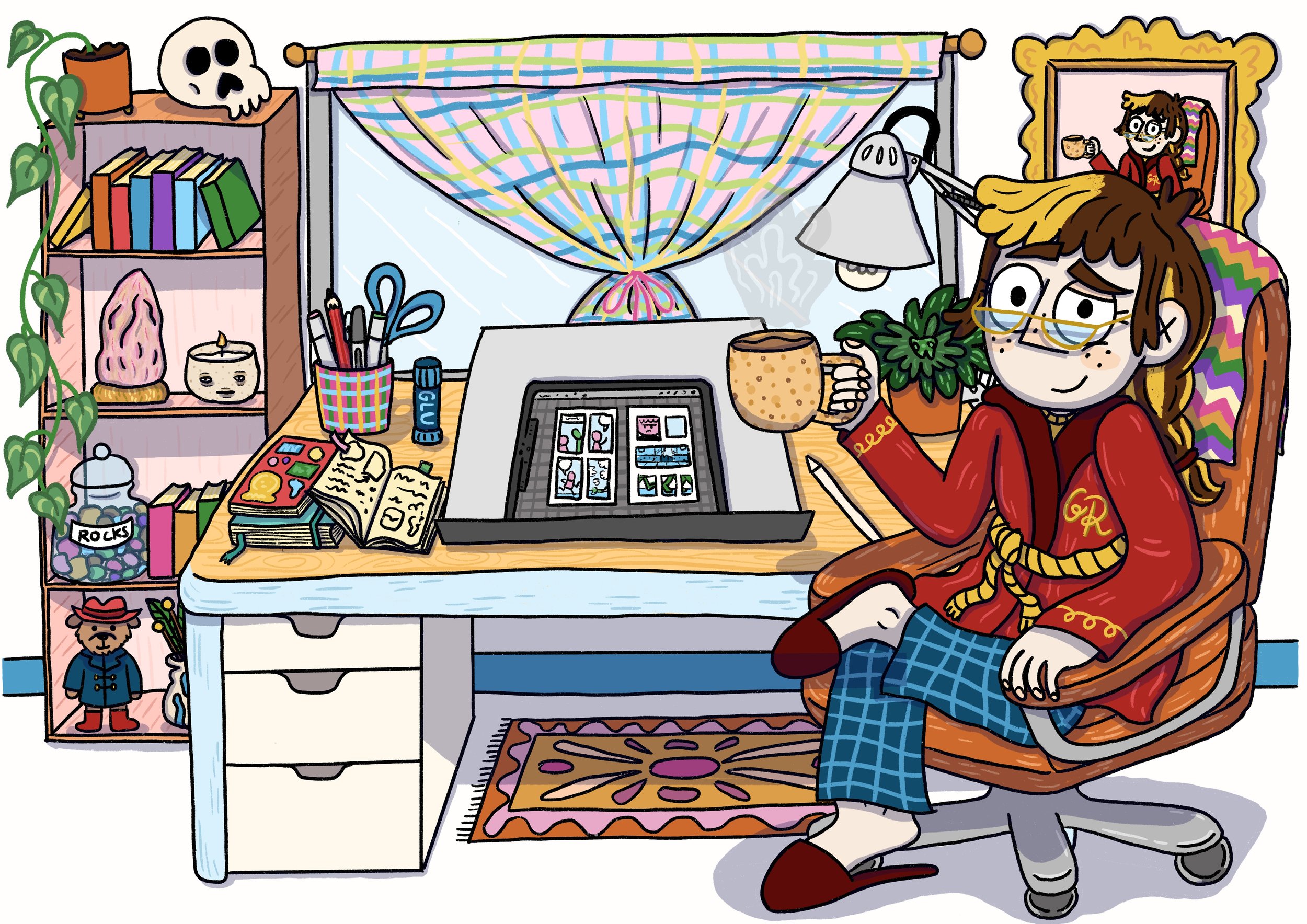
So I've been thinking for a while that I should start giving you guys more updates on the progress of the book. I'm sorry it's mostly words, time at the moment is sparse and I have to really get down and focused on this book. So please forgive the lack of photos/pictures/visual reading aids. Anyway, here goes update numero uno:

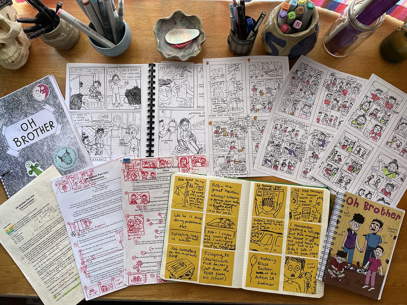
Since I finished part two, I've had my edit session with my comics pals (which you can read all about here) and collected, taken note of and thought about all the feedback, and then put it aside for now. I've decided I wanted to focus on getting the script done for part three (the final part) so I can start thumbnailing and then penciling the draft comic pages. 

At the moment I've outlined all the stories that I think I should cover in this part. I'm now going through and fleshing out the stories that I haven't written in full yet and editing the already-written stories so they fit better into the book as it stands now (it evolves with every scene I write). 

The stories for part three come from interviews with my parents and events that I remember happening to me growing up. The theme for this chapter will be Fears (the theme for part one was Communication and part two was Obsessions).

I've been chipping away, trying to get one story or section finished every day, but I've been really struggling to keep motivated. This section (although still heavily talking about stories of my childhood) has a lot more emphasis on the emotions and feelings behind growing up with Rob and the fears that I hold around what happens when my parents die and I become Rob's guardian. 

I originally wanted to have the script all done by June so I could start thumbs and pencils in July, finishing everything up in August. However, it is now July and and I am yet to get this script finished. Admittedly, the written word is not my forte and I find the problem-solving of panel layouts and the inking of pencils the best bit about comic making. But to get there I have to get this script done. 

Although I knew this part of the book would be hardest to write, I didn't realise just how hard or just how it would make me feel going back over some of the more emotionally draining stories about growing up with Rob. 

And I thought I knew my feelings about what the future holds for me and Rob, but in writing the script I have found that they are not as clear cut as I thought, which makes writing a little harder and takes a little longer than I would like. 

I know it doesn't really matter how long it takes me to get this part written but I I feel like I really need to get this book done soon: I need to get this book out of me. I'm a little bit sick of writing stories about myself (I'm definitely sick of drawing myself). So I'm really looking forward to finishing this project and getting into writing some fiction again. 

So I'm going to give myself a soft deadline of August to have the script done by and now I've told you guys I'll check back in a month with an update. Fingers crossed I'll be deep into thumbnailing. 

Catch you soon!

G xx


My blog is brought to you by the help of my Patreon Pals. If you want to become a George Rex Patreon Pal, then just jump to my Patreon page here. 

For The Love Of Editing


Hello pals!  

As long promised, I have here a post about the editing process I've been using to work through story problems in my graphic novel. It's pretty much the same process I was introduced to at the Comic Art Workshop residency in 2015, which I completely fell in love with and have adapted into my own writing practice. 

I never thought I would actually look forward to and enjoy receiving feedback on any of my creative practices (I studied classical percussion at Uni and was terrible at getting feedback on my musical performances; I took everything personally and couldn't separate myself from the performance), but this method of editing has really helped me to embrace areas in my story that could be improved and not feel like I'm a failure of a human because my story needs some help from my friends.

Never underestimate the power of outside eyes! For example. I'd not noticed that I had never mentioned whether my brother or I were the older sibling, because it was something that I knew so well I'd completely forgotten that any reader who wasn't a good friend or a family member wouldn't know. This meant that people going into the story would make assumptions about which of us was older (it's me, just so you know). The upshot of this was that the reader, not knowing this information, would assume that I was whichever sibling they were (if they were older I was the older sibling too and if they were younger I was obviously the younger sibling). It was great that the readers would identify so heavily with me that they placed themselves in my position but I really needed them to know that I was the older sibling because it's important to how I tell my stories. 

So this is sort of a step-by-step guide about how to use the editing process I do (with a few personal interjects from my cartoon self).  

For the love of editing 3_edit_Colour_Flat.jpg

I hope that made sense and was hopefully some use to you and your creating!

Have a wonderful day, whichever day it might be.

Gx

My blog is brought to you by the help of my Patreon Pals. If you want to become a George Rex Patreon Pal, then just jump to my Patreon page here.