Oh Brother Prep work, Part 1: Building Character


Four cartoon drawings of a young boy (my brother) from four different angles. He has his fingers in his ears and is wearing a pink tee shirt and pink track pants.

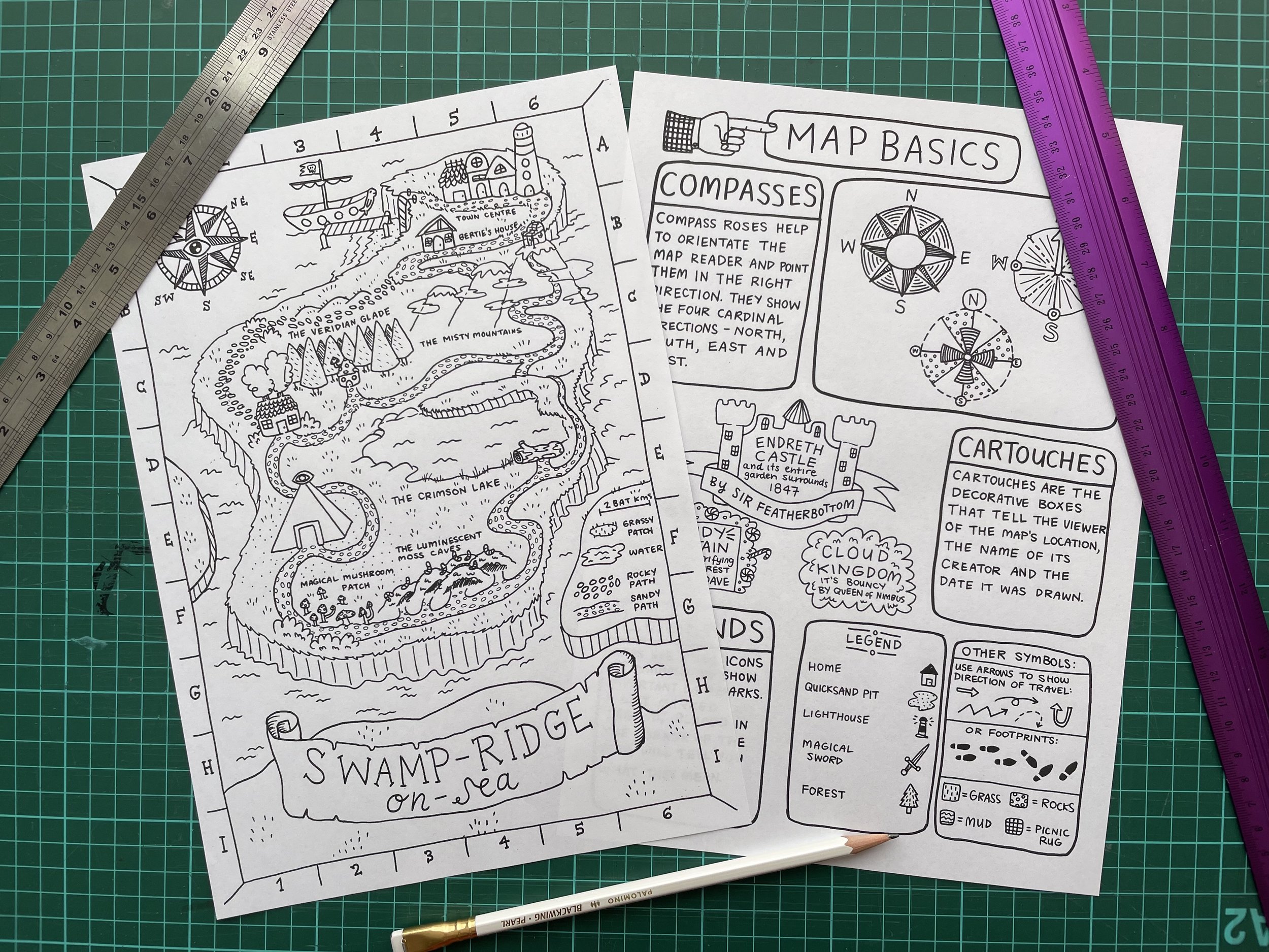
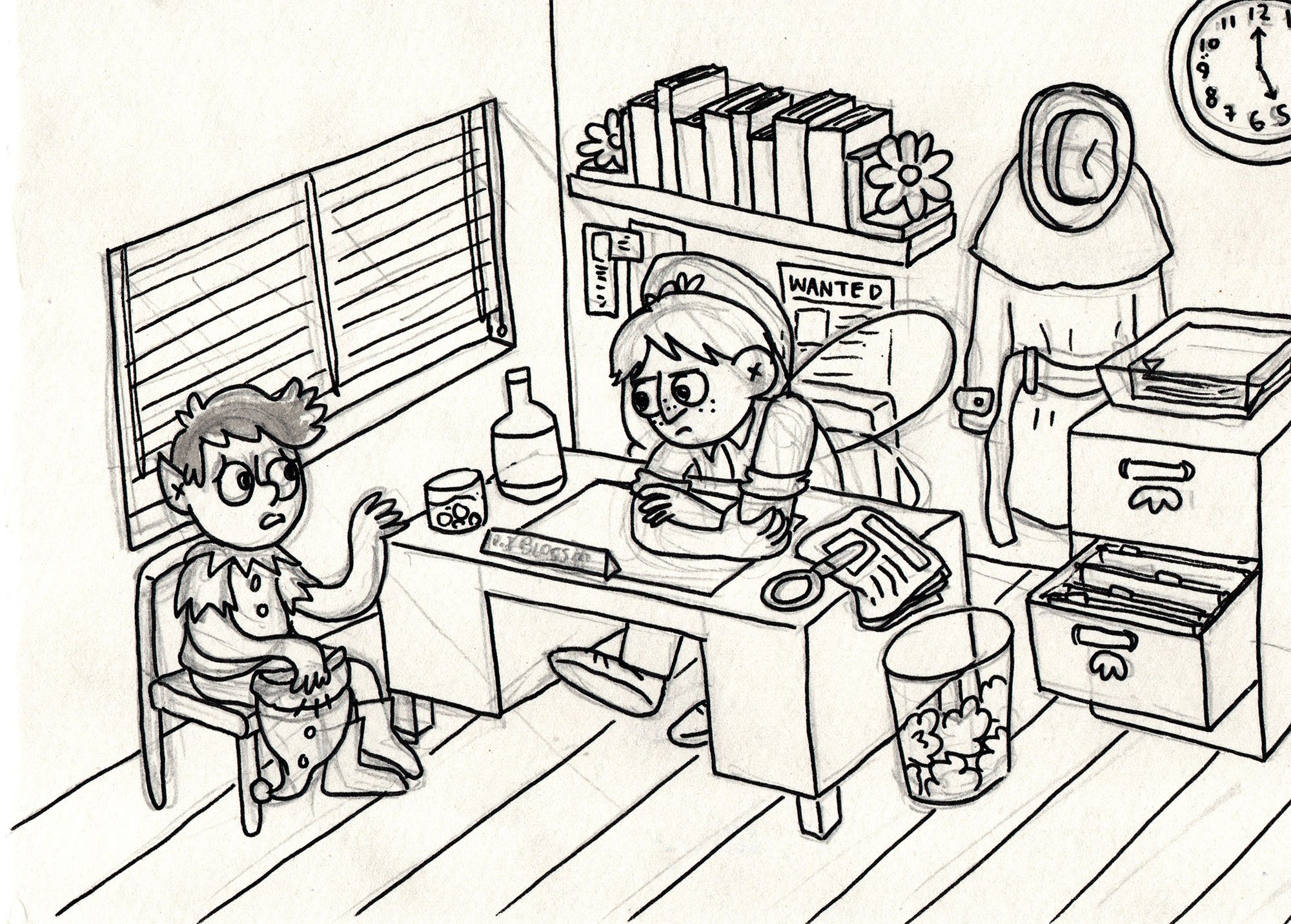
I’m deep into penciling my book at the moment, working hard to hit my publisher deadlines, but I thought I’d share a look at the prep work I do for a story. This is stuff I do before I start working on the thumbnails (roughly drawn comic script) and often even before I start working on the written script.

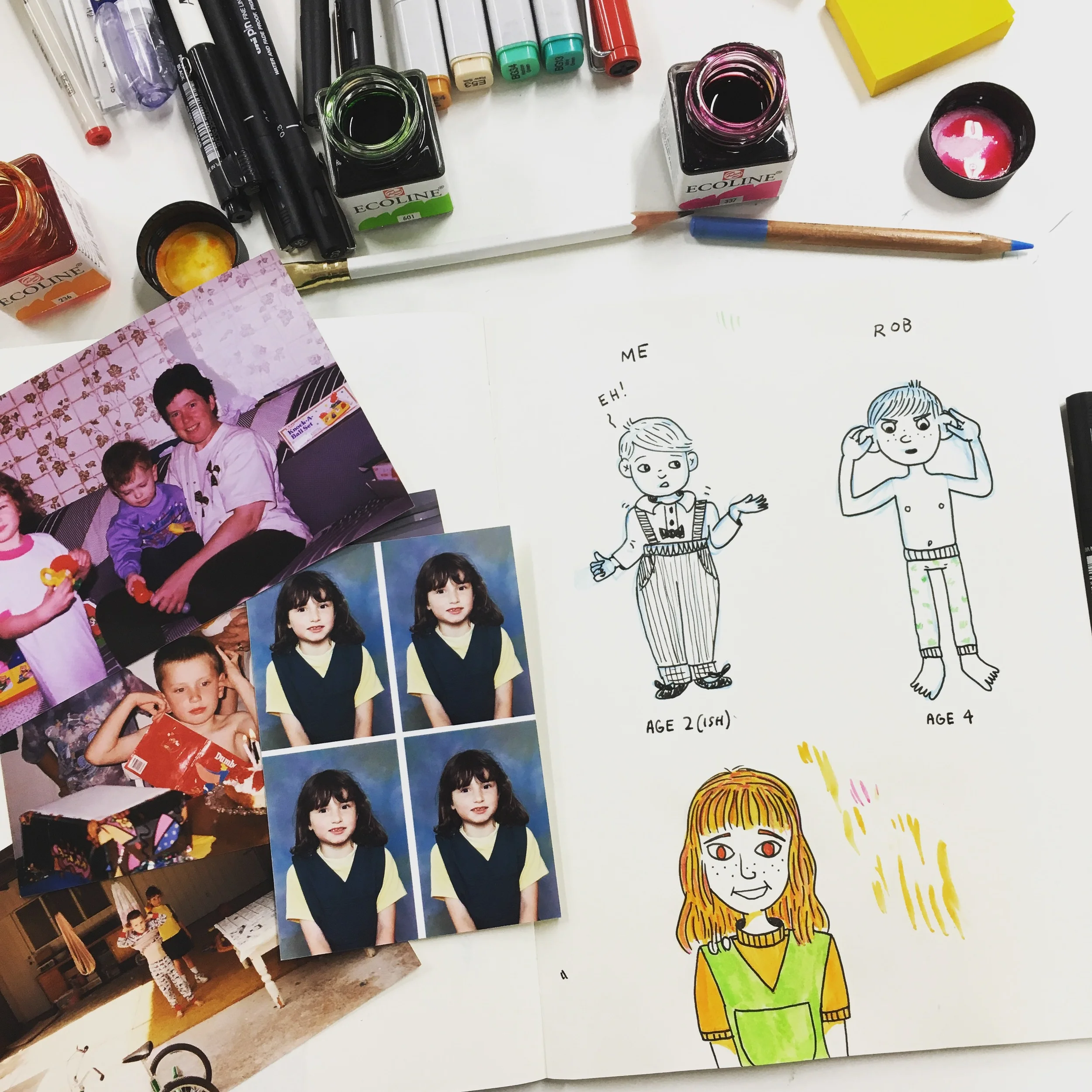
The first thing I do is, unsurprisingly, draw the main characters. The reason for this, of course, is so I have a reference to what the characters look like, so when drawing them repeatedly over the 250+ pages of story I can keep them consistent and easily recognisable for readers. But I have to admit I used to hate doing turnarounds (drawing your character from multiple angles) and would usually only draw a character once in one very straight, boring pose. Back in 2016, when I first started working on Oh Brother, this was what my main characters looked like:

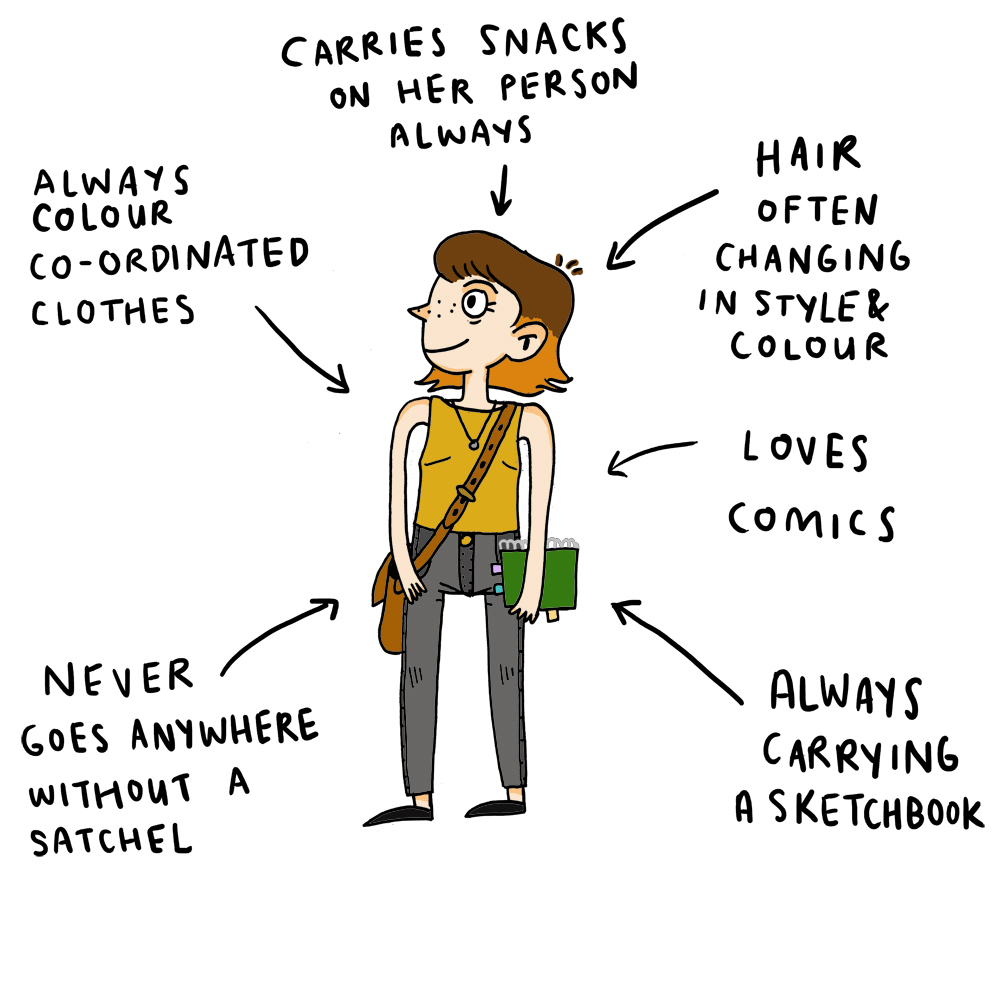
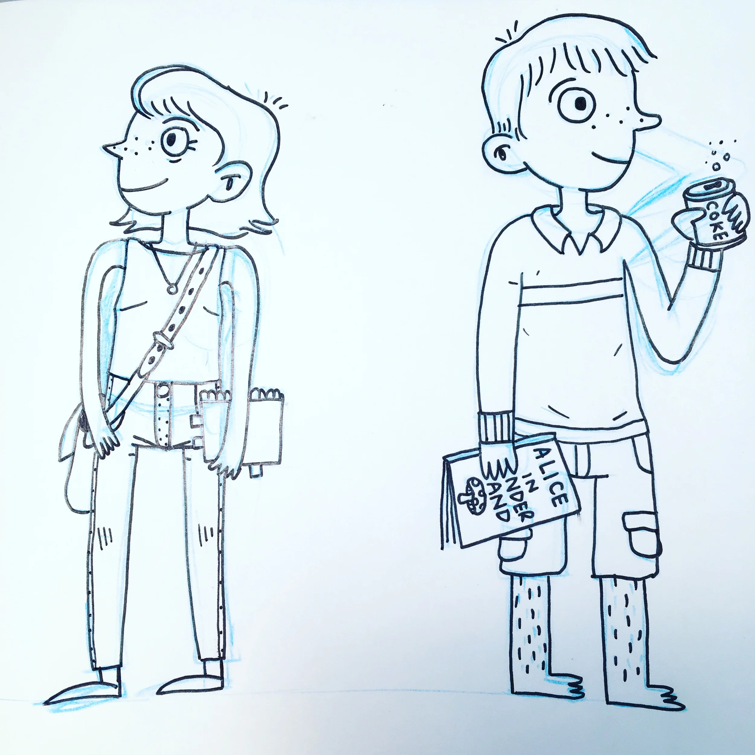
Black and white drawing of four people. Mum (short, curly hair, teeshirt and jeans) is covered in paint and holding a paintbrush. Dad (short spiky hair, jeans and woollen jumper) is holding a laptop and a hammer. Rob (short straight hair, rugby knit top, shorts and bare feet) is holding a can of coke and a picture book. Gina (bob-length hair, jeans and sleeveless top) is holding a sketchbook and a satchel bag.

As you can see, my style has changed and refined itself a bit since 2016, although the main elements of the characters are still there. My brother and I were also adults in this version of Oh Brother (which was told from my adult perspective looking back at my childhood). The biggest shock to me is that I hadn’t started drawing crosses in people’s ears yet (which is now my ear squiggle of choice).

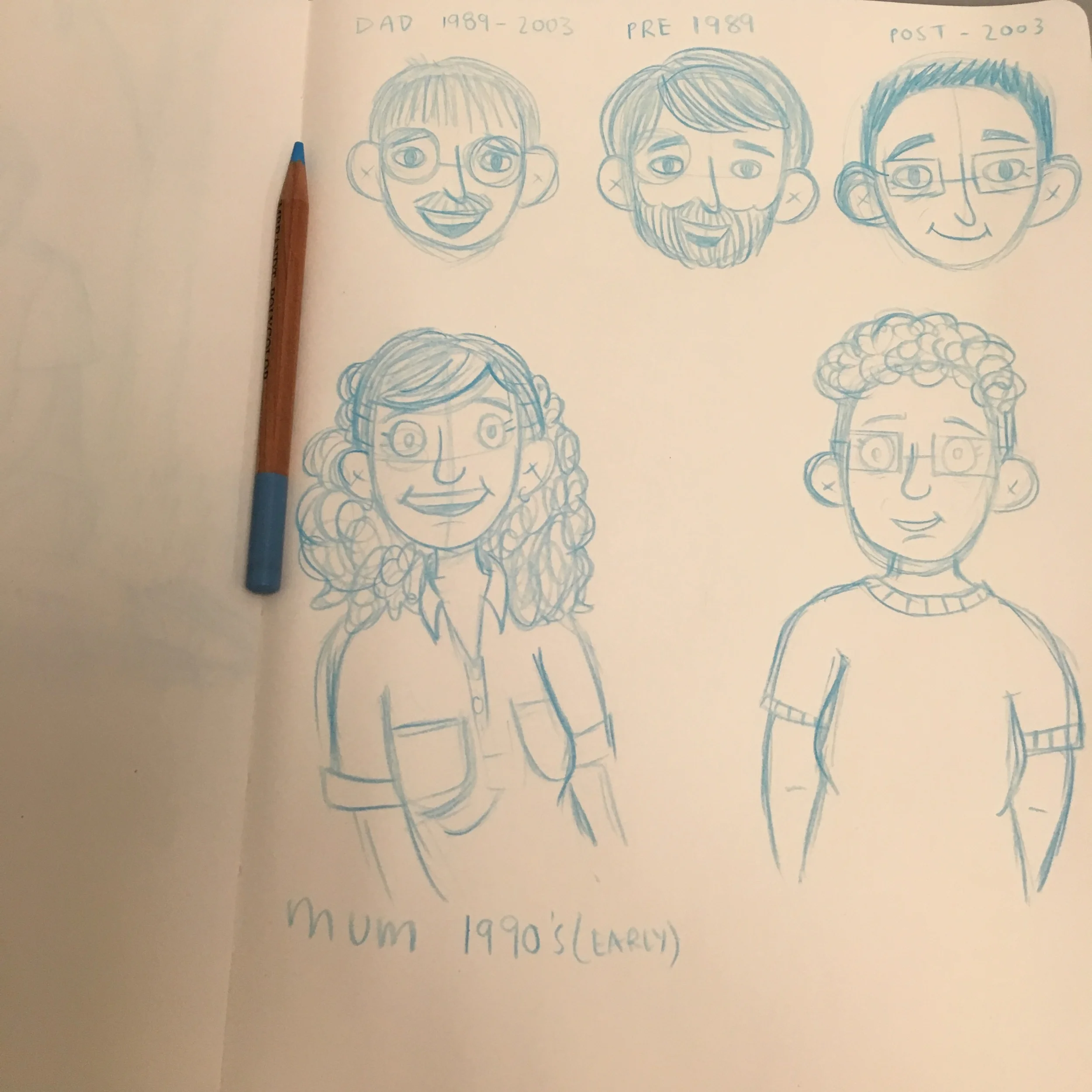
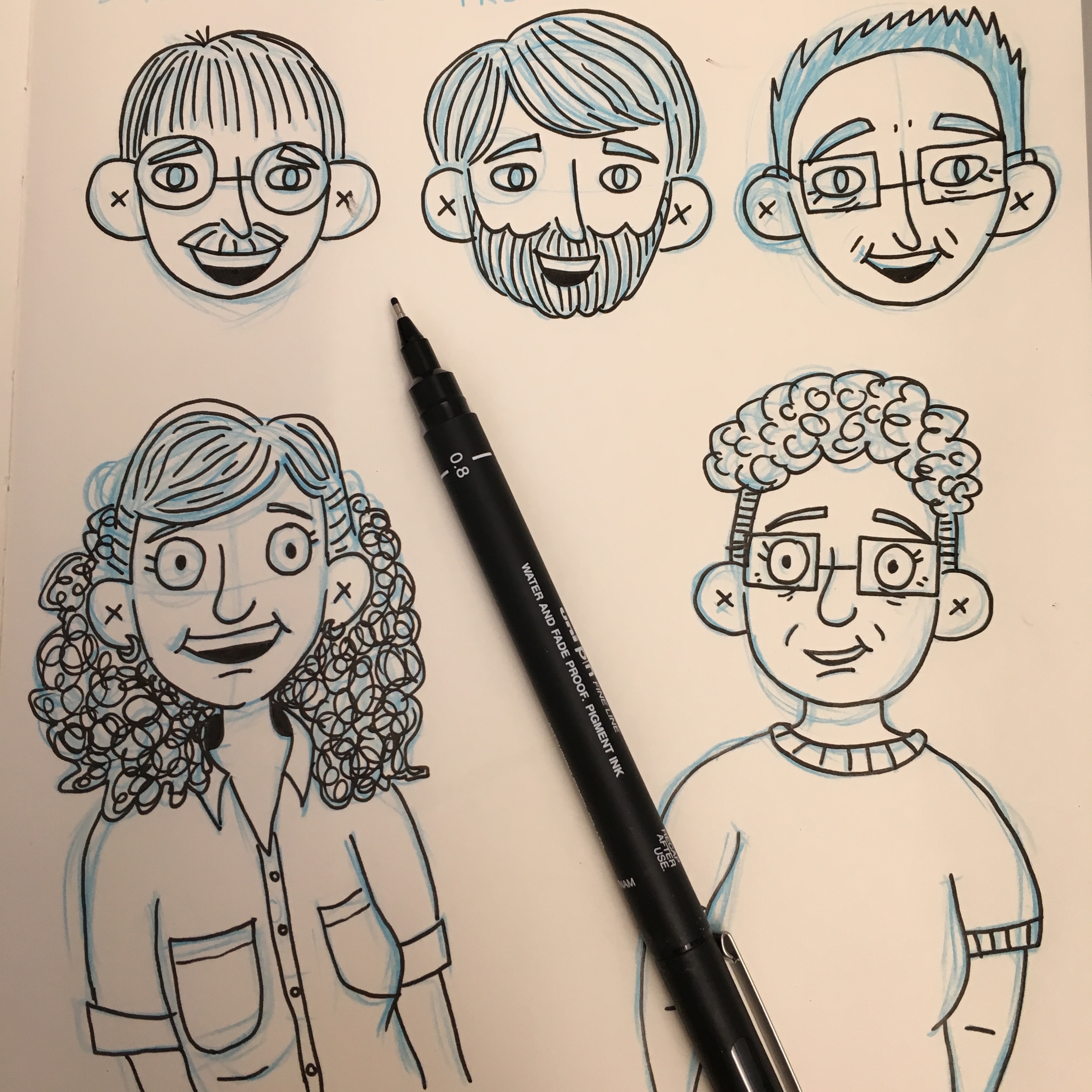
As the years went by, and many versions, edits and rough penciled comics later, the way I drew my family had changed, including drawing everyone younger because the book was now told from my childhood perspective (hence why Dad has a moustache in the picture below - he shaved it off by the time I was an adult). By 2020, I was working with my agent, Annabel Barker, to pitch my book to publishers. Here is the family redraw for the pitch:

Four cartoon images of a young family standing on brown carpet. Mum (in purple colours) and Dad (in blue colours) stand behind Rob (in a pink jumpsuit, fingers in his ears and chew toy at his belt) and Gina (in red colours and with a pink birthmark on one leg).

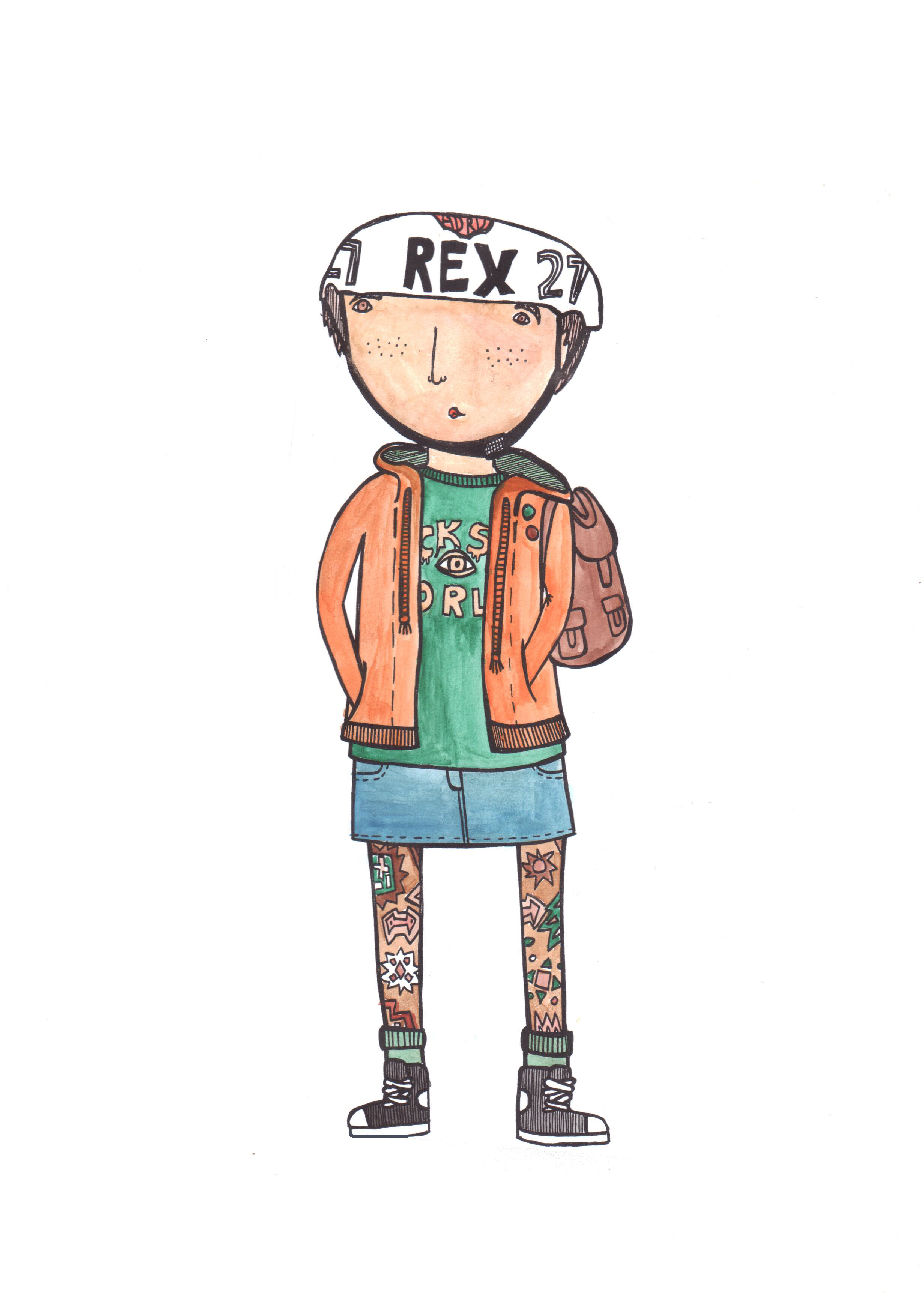
After Oh Brother was picked up by a publisher, it quickly became clear that I needed to revisit my character reference sheets for this new version of the book. Not only because how I drew had changed so much since starting the book in 2016 but also because I had added a whole new main character for this version of the book: Callie, Gina’s best friend.

Four cartoon drawings of a young girl (Callie, best friend) from four different angles. She is standing straight and has long brown hair and is wearing a green tee, blue jean shorts, gold sleeper earrings and white sneakers.

Callie is an amalgam of a few of my real-life friends and their experiences with Rob, so I was able to create an entirely new character design for her (although it is loosely based on a few friends). As the newest character, she has changed the most as I’ve worked on the thumbnails and pencils, purely because I’ve drawn her a lot less than the other characters. (But, to be honest, my style is wobbly at the best of times anyway, so there is always some healthy shapeshifting in my characters.)

Four cartoon drawings of a woman (my mother) from four different angles. She is standing straight and is wearing a purple sleeveless top, blue jeans and purple sandals.

Speaking of shapeshifting, the character - or should I say element of a character - that I (still) find the hardest is my Mum’s hair. It doesn’t seem to matter how many times I draw it, its shape eludes me. This was also when I started confirming which colours I would associate with each character (again for ease of reading and knowing who is who).

Four cartoon drawings of a man (my father) from four different angles. He standing straight and is wearing a blue tee with a high collar, blue jeans and and dorky white sneakers.

The character I found easiest to draw was my Dad. We look pretty similar (facially) in real life so when cartooning Dad I basically draw myself with a moustache and spiky hair. When I’m not paying attention, I draw my freckles on Dad instead of his stubble (and vice versa!).

Four cartoon drawings of a young boy (my brother) from four different angles. He has his fingers in his ears and is wearing a pink tee shirt and pink track pants.

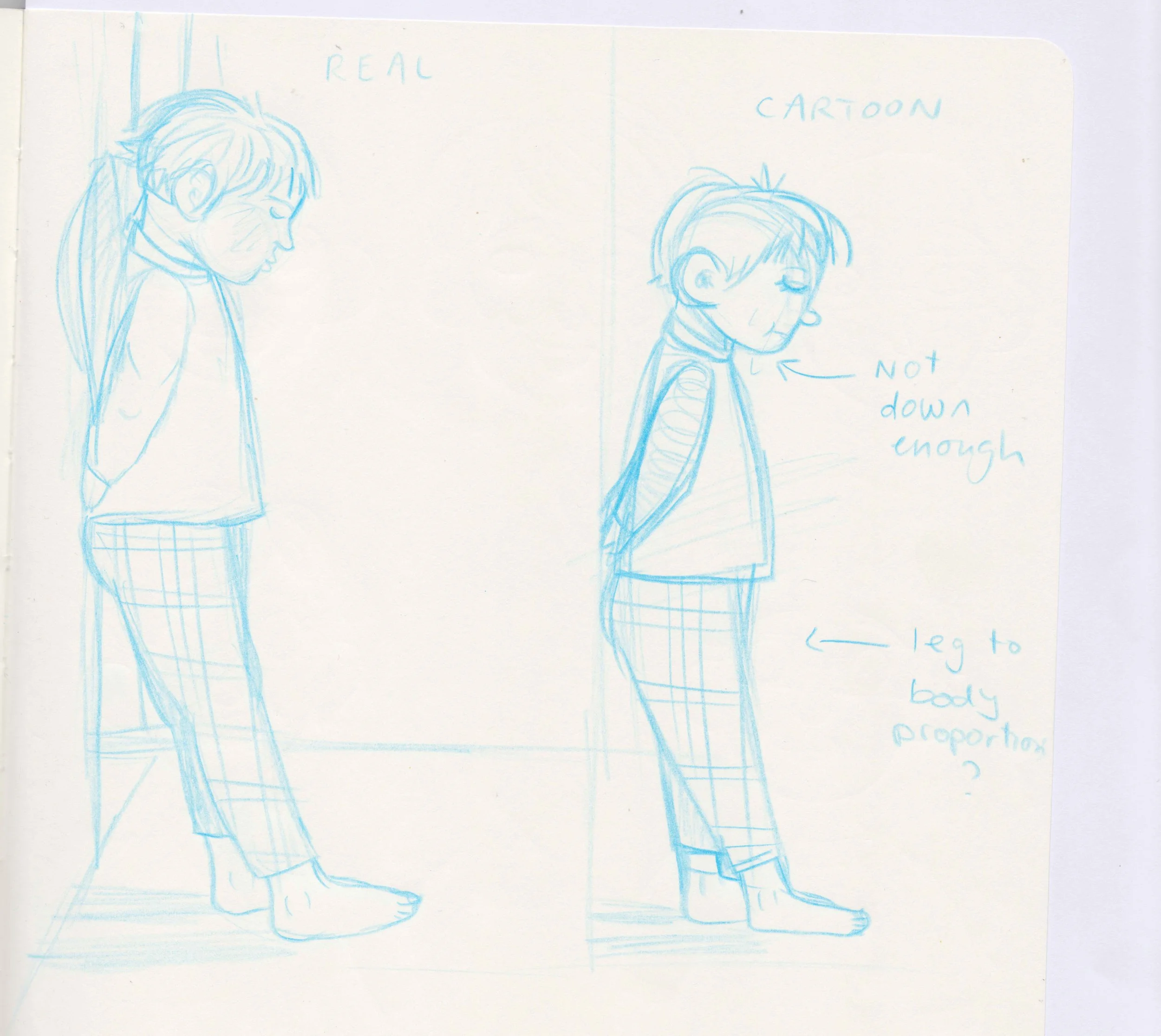
I find Rob a fun character to draw but also really tricky. The way he holds himself (in real life he is constantly moving) is something that can be really hard to capture in still cartoon images. But it’s a fun challenge to try to get across his actions in the comics. For the new turnaround, I had to find a way to clearly show that he had his fingers in his ears from the different angles (which was harder than I thought it would be).

Four cartoon drawings of a young girl (me) from four different angles. She is standing straight(ish) and is wearing a red tee, blue jean shorts and and red sneakers. She has a pink birthmark on one of her unshaven legs.

By the time I decided to redo my character design sheets for this version of the book, I had gotten over my dislike of turnarounds and embraced them as a good way to get to know these new versions of the characters. I wanted to be able to draw more interesting angles and scenes in my book (and not just talking heads - which is my natural instinct), so I needed to know what my characters looked like from multiple angles.

But I didn’t stop at just turnarounds! In my next blog I’ll get ‘emotional’ and start playing around with drawing a full range of facial expressions for all of my characters.

Into the Comics Mines


An illustration of Gina holding an iPad, paper, pack of pretzels and a cup of tea and wearing a sash of pencils and a cap with a candle melted to the brim. Gina is looking unenthusiastically at a cave made from comics pages. The cave has signs stuck to it that read “Welcome to the comics mines”, “Danger RSI Ahead”, “Turn back and back up your harddrive” and “Beware of papercuts.”

Hello dear friends! This is it. I’m about to go into the comics mines for the next 6 months (approximately). What does this mean? It means that I will be working 5 days a week on the book with 1 day a week aside for admin & running workshops. Because of this fairly inflexible and tight work schedule, until the book is in the hot little hands of the publisher (approximately August) I will be taking a step back from posting online. This is to help me focus on getting pages done, as my brain starts fritzing out if I have too many projects to juggle, and social media posting in particular takes a lot of my brain energy powers.

📰BUT I will still be sending out my monthly e-newsletter to keep you updated on the book and share sneak peeks at anything else I can manage to squeeze into my spare time (I predict these things to be mostly sleeping, many cups of tea and watering the garden). I love sending out my newsletter and it makes me real happy when folks sign up - it’s the best way to let you know what I’ve been up to.

Drawing Buddies - January Challenge


Above: Roof Rat by George Rex based on Jake Holmes’s Roof Rat.

Above left: Roof Rat by Jake Holmes. Based on the Highway Rat by Julia Donaldson, illustrated by Axel Scheffler.

Above right: The Highway Rat by Axel Scheffler.

This year my screenprinter & illustrator pal Jake Holmes (jaketoothandnail on instagram) and I have decided to be drawing buddies. Each month we will take turns to decide on a drawing challenge that we will both undertake over the course of the month. Jake already has his own goal of drawing for at least 30 minutes every day, which he’s been doing for the past couple of years, and I’m trying to do that too this year (that’s 30 minutes of ‘free’ drawing, on top of my Oh Brother work!). The monthly drawing challenges we come up with are more to help us have a guideline of something to draw, if we’re ever stuck for ideas. I’m hoping to use these drawing prompts to challenge my skills, particularly in areas that I’m weakest (perspective, adding backgrounds, light and shadow, pushing poses to be even more animated).

Above left: Jaunty Space Man by George Rex based on Jake Holmes’s illustration “Homecoming”.

Above right: Jake Holmes’s original illustration “Homecoming”.

The January challenge was set by Jake. It was simple: we scroll through each other’s instagram account, pick some characters that the other had already drawn & posted, and then redraw the characters in our own style. My aim was to do one a week throughout January. I tried to pick a range of different characters and then push their poses and add backgrounds (if they didn’t have them already).

Above left: Tina Papanikolas by George Rex, watercolour illustration.

Above right: Tina Papanikolas by Jake Holmes, based on watercolour illustration by George Rex.

Jake ended up drawing a version of one my favourite characters I’ve created in the past few years, Tina Papanikolas, who (along with her new best friend Tori) solves mysteries and crimes happening in their neighbourhood. I love Jake’s version of Tina, particularly how he captures her cool mesh skirt (I get to live out all my fashion dreams through Tina). My version of Tina that Jake based his off is one of the few watercolour illustrations I did last year, when I was trying to get a handle on different mediums.

I really like how Jake uses light and shade to bring his characters to life, and redrawing his characters this month has really pushed me to think about how I use light (or don’t) in my illustration and comics.

Above left: The Gang by George Rex based on Jake Holmes’s cool teens illustration.

Above right: Jake Holmes’s original illustration of three cool teens.

These Jake characters were the most like ones I would normally draw and I had a lot of fun trying to show their personalities through their poses. When I showed Jake my version, he said that he’d been inspired by how I draw characters when creating the original drawings. I thought that was pretty neat.

I had a ton of fun redrawing Jake’s characters and it was a great way to get into the habit of drawing every day, because I knew when I sat down to draw that I didn’t have to think about what to draw, I just had to have a quick scroll through Jake’s instagram and get inspired. So far this year I’ve managed to draw every day for at least half an hour and it feels really good!

Above left: Cheese Wizard by George Rex based on Jake Holmes’s Cheese Wizard illustration.

Above right: Cheese Wizard by Jake Holmes. Jake originally drew this character based on a prompt by me!

It’s been really interesting drawing so much that I notice little habits of mine, like how I generally love my pencil sketch but then hate the inked version (and the flat colours even more). But when I start adding in shading (and highlights) or textures, it all starts coming together. When it’s just inks and flats, it looks okay but it’s kinda like looking at a haircut halfway through, it’s almost there but it hasn’t got that pizzazz of a final drawing.

It’s my choice for our February drawing challenge but I haven’t decided what it will be yet. But I’m looking forward to it and seeing what we both come up with (it’s always more fun to do a drawing challenge with a buddy, it definitely helps to keep me more motivated).

Map-Making


A illustrated map of Swamp-Ridge-on-Sea. A fictional island where supernatural creatures live.

One of my very first loves was map-making: as a kid, maps were one of my favourite things to draw. I would make maps of treasure islands, maps of our neighbourhood and maps of my bedroom (usually during my annual rearranging-fest when I was trying to figure out where I wanted my stuff to be for MAXIMUM BEDROOM PERFECTION. As an adult I still do this but for my studio. The never-ending goal of finding just the right place for everything is a curse I am willing to bear.

Illustrated diagram of the same bedroom with 3 room variations, titled “Various permutations of my room”.

Recently I’ve been getting into the animated series Craig of the Creek (which is absolutely delightful and fast becoming a firm favourite with me - thanks Mitch for the recommendation!). The titular character, Craig, is a self-proclaimed map-boy whose goal (while adventuring with pals) is to map the Creek where all their adventures happen. Watching it has reminded me of my absolute love of maps and prompted me to share some of the maps I’ve made, including this Story Maze Map.

Forest Story Maze Map. The map is of a forest with a yellow sandy path. The words START HERE and a bonfire are in the middle of the forest. Throughout the forest are scattered different monsters.

This one was originally designed for an issue of Pigeon Post (a quarterly publication by 100 Story Building, a centre for young writers). You start in the middle of the forest and choose a path to follow. Throughout the forest are scattered different monsters, events or items and when you come across one of these you need to incorporate them into the story you’re telling.

E.g. It was a bright sunny day and we were in the middle of a lush green forest. The trees were so tall and the canopy was so thick that you could barely see the sky. We couldn’t at all remember how we got here.
“We have to get home!” Sophie said. “It’s almost tea-time! I can’t miss dessert. Not again.”
We all agreed: missing dessert was not acceptable.
“I have a good feeling about the path to the left,” I said.
“I think right is the right way,” said Tom.
“Split the difference?” asked Carsen.
It was settled; we would go down the middle path. A short way into our journey there was a sharp turn which opened into a small clearing where we saw a large black cauldron bubbling over with something sticky, pink and incredibly smelly.

I’d love to do more of these Story Maze Maps. Or just more maps in general. Is it really a story if it doesn’t have a map?

A small section of my collection of maze & map making books.

I’ve shared my love of map-making with a variety of my students over the years. Recently I ran my map-making workshop with my Inky Fingers kids and they took to the challenge of making maps like a duck takes to eating popcorn. Here are some of the maps they created. They had to include:

  • A compass

  • A key (with 3 different items, e.g road, forest, lake)

  • A cartouche (a fancy illustrated title for the map, so people know what it is a map of and who drew it)

  • At least 3 special landmarks (e.g. home, a mysterious mountain, the best fish & chip shop).

I’ve been wanting to put together a short map-drawing activity book for a while (maybe once the final art is all done for Oh Brother and I have a bit more free time). But I have created a little guided resource for the workshops I currently run and I’ve just popped a free downloadable PDF version up on my online store. So if you’re looking for a fun summer holiday activity, head here to download it for free.

Two black and white worksheets on a green checked cutting board with two rulers and a lead pencil.

I love poring over maps of all types, they help me make sense of a world and give me a feeling of comfort and order. But also there is so much storytelling you can do with maps! If you have a go at making your own map, I’d love to see what you come up with.

A short comic where a friendly postal bat give a map to two lost witches.

Noodling around with ink wash


A while back I rediscovered a heap of ink wash pens I’d made back when I thought I would really get into using brushes and ink. I’d decided to start off with brush pens instead of jumping straight into using regular brushes (which seemed tricky and impossible, and still does a bit!). I took three refillable reservoir watercolour brush pens and filled each of them with varying ratios of ink. One pen was mostly water with just a bit of ink, another pen was 50/50 water/ink and the final pen was all ink.

Three brush pens with refillable reservoirs. Each pen has slightly darker ink than the one before.

I tried them out for a bit but at the time I don’t think I really liked the messy line I was making (after exclusively using fineliners my entire illustrative life) and couldn’t push through the uncomfortable perfectionist talk my brain was giving me, so I gave up on that inky brush dream. Recently, however, having used a bit more watercolour, I was curious about trying these out again, but treating them more like shading tools (and keeping those strong fineliner lines I feel confident with. Baby steps!). I mostly used the first two brush pens (the one that is mostly water and the 50/50 one). But I wanted to make sure that the scene I was drawing felt like it should be in B&W, so of course I landed with a fairy private detective in a film noir-style setting. Here are the steps I took to create this piece:

Step 1: Sketch it out

Using whatever scrap paper I had lying around, I sketched out the design loosely. As I wanted to practice my perspective (my nemesis) as well as using only shades of grey instead of colour, I had to draw this scene a few times to get it as close as I could to what I wanted. I was struggling to decide if I wanted it to be in isometric perspective or a more real perspective. I feel like I kinda landed somewhere in between.

Step 1: A rough pen sketch of a pixie sitting in a private detective’s office. The detective is a fairy.

Step 2: Pencil and Ink

Now that I’d come up with a game plan, I popped over to our light table and, on a fresh piece of paper, pencilled out the scene again (using the sketch underneath for a guide). I then turned off the light table and inked the pencilled drawing. You can see where I’ve (not particularly successfully) tried to start marking in where I think the light might fall.

Step 2: A tight drawing of the pixie and the detective fairy. You can see some lead pencil marks under the clean simple inked line work.

Step 3: Final Inks and Ink Wash

I wasn’t super happy with how I inked the scene the first time, so I actually inked it again on a fresh piece of paper (getting out the light table again and using the pencil/inked drawing for the guide this time). If you look closely at Step 2 and 3 you can spot the minor differences in the line work (and some things that are missing!).

Once inked (with a fineliner), I erased the pencils and added in the shading with the ink wash brushes. As someone who generally just block colours everything, it was an interesting experience figuring out what to colour in and what to leave as a highlight.

Step 3: The same scene of the pixie and detective fairy but now it also has ink wash added to give depth, shading and indicate where the light source is coming from.

Although the line work is still a bit wonky, the perspective isn’t perfect and the lighting is…fine, I’m pretty happy with how this turned out in the end. I particularly loved the texture in the picture that came from using paper with more of a rough tooth (I usually use the smoothest of paper as I hate the feeling of my fineliners on a rough paper).

Anyway, that’s it! I really enjoyed working in greyscale and it really highlighted to me how little I know about shading and light. Lots to practice! I would love to do more ink wash and refine those skills for sure. Maybe I should make a whole comic about this fairy detective (or at least paint some keys scenes from a possible story a fairy detective might go through)?

Experimenting with Watercolour


New BFFs Tina and Tori sit in their pyjamas, eating lollipops and reading comics on Tina’s bedroom floor.

I know that my last post was all about how I’ve been slowly moving towards working entirely digitally (which is really useful when working with clients and editors and I’m having to make lots of tweaks and changes on a project), but I think working so much on my iPad for work-based illustration and comics has pushed me into wanting to try out different mediums when making fun illustrations for myself. In particular, I’ve really been keen to get into watercolour.

Tina is wearing her favourite clothes that make her happy, showing off her multicoloured scarf and green tile skirt.

I’ve tried delving into watercolour a few times: I’ve tried plein air painting, I’ve asked friends for tips, I’ve watched YouTube videos. I aways thought that if I just found the “right” set of watercolours that it would all make sense and I’d be able to paint the images like I could see them in my head. But what has really stopped me in my tracks every time I’ve tried my hand at watercolours is the fact that I’m just not that good at using them straight away (not that there is any reason why I should be naturally adept at watercolours). So I kinda give up before I give myself a chance to really learn how to handle them.

My watercolour tribute to Mr Tod (the kind-of-a-jerk fox gentleman character from Beatrix Potter’s book).

With some (possibly unfounded) optimism that this time would be different, for my birthday this year I treated myself to the Kuretake Gansai Tambi watercolour set. I’d seen a few mates use them online and they looked quite different to other watercolours I’d tried before. And they are pretty lovely to use, almost more like a gouache so the colours are more opaque (less see-through) than other watercolours. As I’m so used to working in smooth flat digital colour, I find that that the washy-ness of watercolours makes my attempts look not like my own art. (Although I love this look in other people’s work, I’ve found I don’t love it for my work.) However, when I started playing around with the Gansai Tambi’s more opaque pigments, I found them really pleasing to use and like I had more sense of how to handle them. Plus, the colours are delightful and warm my soul.

Kuretake Gansai Tambi 48 colour watercolour set (includes a really great pink and lilac as well as boss metallic colours).

Although I’m enjoying watercolours a lot more this time, it does feel like I'm back to basics and having to learn how to make art yet again. But I’m really excited about learning new art skills and how to control and use watercolours so they can help me create more interesting works. This time that I’ve delved into watercolours, it feels like a puzzle to solve instead of me just failing at something I “should” be good at. My brain feel like it clicks into gear and wants to make the images in my head appear on the page in front me.

A fancy-looking anthropomorphic dog with a moustache wearing a red dressing gown stands in front of an old and full bookcase. They are holding a bone in one hand and an old-fashioned smoking pipe in the other.

After chatting to another friend, they mentioned I should try using coloured pencil on top of the watercolour for more detailed things, which I loved when I tried it out with this fancy dog in a smoking jacket picture (see above). I haven’t really tried all the possibilities with pencils & watercolour yet but I’m keen to see where that could go too. Sensory-wise, it feels really nice to draw with pencil over the watercolours.

Scully, junior “repawtor” for the The Fire Hydrant, sits, bored, at their desk waiting for an exciting story to break.

I love the flexibility of working digitally but nothing draws me into a work more than if it’s traditionally watercoloured or coloured by pencil (particularly if you can see the mistakes or wobbles the artist has made). There is something about the hand-made nature of it and the textures of the paint on paper that speaks to my soul. Maybe one day I’ll be able to make a watercolored picture book. I do not think that I will ever watercolour a whole comic though. That way madness lies.

My transition to working digitally


Bundle (a mushroom person) and Bugg (Bundle’s pet bug) stand out the front of their home in an old tree.

Over the past few years, I’ve really transitioned to working digitally over traditionally. The switch happened slowly at first: I would still pencil and ink everything traditionally but scan it and then colour in Photoshop. But when the response of the Apple Pencil on the iPad started to feel almost exactly like using a regular pencil and I discovered the app Procreate (plus factoring in the ease of being able to create work on the go, anywhere, with just one tablet and one pen), I couldn’t resist the lure of digital.

A character with one prosthetic leg, wearing a tank top and shorts, standing in a welcoming position.

One of the things I've discovered when drawing digitally is that I've been able to experiment more with my art, without freaking out that I’m going to ruin everything. When working traditionally, the permanentness of using pens, textas, or paints can sometimes almost make me freeze (particularly when my perfectionism comes into play). But the flexibility of working digitally (sure, being able to undo is nice, but also to be able to copy, stretch and rearrange things easily) has really opened up a lot of options for the work I create. I can practice pushing my characters’ poses or getting that emotion exactly right on their face or try different colour combinations without worrying that if I commit to one and it doesn’t turn out okay, I’ll have to re-draw the whole image to practice it.

A character in full shadow wearing a woollen jumper and patched jeans holds their hand up to their eyes and is looking at something far away.

Working with light and shadow is something in particular that I’ve really gotten into playing around with when drawing on my iPad. Usually my drawings use simple clean lines with flat colours, but I’ve really enjoyed starting using coloured lines for textures ( e.g. in clothes, hair) as well as adding shadows to create a bit more depth to the flat images. More recently I’ve started playing around with adding highlights too - I’m still a while away from feeling like I’ve got a handle on those but it’s coming along.

A wizard in a purple robe covered in yellow stars and moons is holding a glowing orb and has a magical aura around them.

Full colour illustration of 5 roller derby players in roller skates and safety gear posing together looking tough and confident.

One of my favourite things about working digitally are the accidents that turn out to be really interesting and get me thinking about how I could colour in a different way. For example, I drew a collection of fictional roller derby players and coloured them as I normally would - natural, flat colours, add some shading for depth and then highlights to help create a sense of roundness in the characters. At one point I’d switched to the wrong layer and when I went to drop some colour into one of the characters I accidentally just blocked out all of the characters in this salmon pink colour. Initially I was all “Gah! Silly me!” Wrong layer!” but looking at the result I really loved how it turned out. It opened up my brain to thinking about how I could be using colour differently when making comics. I’m keen to see what a full comic of block colours might look like.

Pink & purple illustration of 5 roller derby players in roller skates and safety gear posing together looking tough and confident.

I still love working traditionally (I don't think anything will ever quite beat the scratch of pen on paper) but I think that working digitally has really helped me grow as an artist and refine my skills, so whenever I jump back to working traditionally (or try out mediums I’ve never used much, like watercolours or colour pencil or stamp carving), I feel more confident about giving things a go (and not worrying about whether they turn out exactly right).

Poppy & Gina's post-it note challenge


When I’m not reading comics, talking about comics with my friends or making my own comics, I teach comics. I predominantly run one-off workshops in schools and libraries, mostly to excellent children and young people. But I also have a few students that I teach privately, one-to-one. One of these students is the lovely Poppy.

I’ve worked with Poppy for a little while now - in lessons we generally talk about drawing techniques, try out different art mediums or materials, and chip away at putting together original comics (Poppy will be selling her very first comic at the upcoming Zina Warrior Print Fest). One of the drawing activities we did recently was a daily character challenge. During one lesson, Poppy and I came up with a list of 30 characters (e.g. a fortune-telling mermaid or a goth unicorn), one for each day in June (each of us taking turns to come up with a character). The aim was to draw a character a day, with the only restriction being that they had to be drawn on post-it notes.

I absolutely love these kind of challenges, although I have to admit that I can also find them very hard. I really struggle to put time aside for myself just to draw (when it’s for no reason other than fun). Also sometimes my perfectionism can sneak in and stop me enjoying the thing I love most - telling stories with pictures.

But having the restriction of the post-it note was really helpful for me to finish this challenge. It gave me a boundary to work within and meant that I felt more inclined to push that boundary (like trying to fit in full scenes onto my small little post-its and not just characters). And I was really happy with how a lot of them turned out and even prouder of myself for pushing through the days where I wasn’t so happy with the work and still sitting down and doing the next day’s challenge. Perfectionism in my work is something that I struggle with A LOT (although you wouldn’t necessarily know it from looking at my wonky imperfect art) and I have to keep catching myself when I get stuck In a perfectionism spiral and remind myself to just put pen to paper, and it can’t be perfect but it can exist.

In the end I had a lot of fun designing these characters (there are definitely a few that I wouldn’t mind maybe turning into full-comics ideas) and it was particularly fun to do the challenge with a friend and see how different or similar our characters turned out to be. Here are some of Poppy’s favourite designs:

Looking to take on a fun drawing challenge? Why not try out our post-it note drawing challenge for yourself (and a friend)!

All you need:

  • Pen

  • Post-it notes (your choice of colours)

  • A month with 30 days (so you can draw one a day)

  • Our character list below!

If you do decide to take on the Poppy & Gina post-it note drawing challenge, let me know! I’d love to see your versions of our characters.

Poppy and I will be selling physical zine versions of this list and some of our favourite characters at Zina Warrior Print Fest. If you’re on Kaurna land (Adelaide) on the 8th October, come along and say hi!

Self portraits


The other day I was asked to write a bio for a comics piece I did that was about to be published and, as is customary, provide an accompanying self portrait. I searched my self portrait files for an appropriate illustration (I rarely provide an actual photograph because comics) and as I've been writing autobio comics for pretty much my entire cartooning life I thought it would be easy to find something that would work. But to my dismay I couldn't find one that really represented how I was currently drawing. Also I'd just gotten a haircut and now sported a wicked fringe. So I quickly drew up a headshot of myself and sent it off. 

After searching through those self portrait pictures I felt a burst of nostalgia towards all those styles that I had tried out, embodied for a while and then moved on to the next George Rex look. Like a hermit crab finding the right shell.  

So I thought I'd share with you a little timeline of my cartoon selves from yesteryear leading up to just this week. 

Let's start with my most recent self-portrait and a general overview of some of my hairstyles (and then jump back to the less great ones of my teen years and move chronologically).

This is my most recent self portrait. Still having trouble drawing my killer fringe. 

This is my most recent self portrait. Still having trouble drawing my killer fringe. 

Below is the hair guide I originally drew up for my Oh Brother graphic novel. Even though I only drew it last year I already find the illustration alien and strange compared to how I'm working now. Like reading an old diary entry. 

Next up is the earliest self-portrait I could find, from circa 2005 (I would have been 14-y-o). This was taken from the one of the comics I made in high school about the music teachers, in which I would constantly play with reality and breaking the fourth wall. Note: This was the height of my Goon Show and Monty Python fandom. 

Below is me from an early 2009 (I would have been 18) comic zine called 'A Week of Perfect Conversations'. It was all about the semi-realistic adventures of me and my friend Kyra (who was travelling around the world on a gap year post high school graduation). This comic was drawn coming out of my Jhonen Vasquez (Squee, Invader Zim) phase and for some reason I picked up this habit of drawing eyes coming off the side of people's heads and drawing thin lines in place of actual backgrounds. Also I apparently couldn't decide between all caps or lower case for my speech bubbles. Note: This 'joke' doesn't make much more sense when you read the rest of the comic.   

The self-involved little portrait below is, unfortunately, the most whiny teenager portrait ever. I think it would be from about 2009/2010. I almost didn't include it in this post because it's a pretty embarrassing insight into my brain from when I was 18/19, but I thought it was good example of how I've been using labels and arrows and words as part of my portraits for ages. It also has this almost side note about how worried I was about my jaw reconstruction that brings me straight back to that time after I'd had my jaw partially removed (due to cancer) and before I knew that my jaw was going to grow back after the surgery (like magic). It was a weird time of relief for the most part but with just a hint of uncertainty. 

These guys below were drawn about 2011 (I would've been 20). I had been dabbling in watercolours and started reading a broader range of indie comics and art books. Even though I'll never draw like this again I really like these portraits because it's when I started to really love drawing what I was wearing and when I started to buy and wear clothes that were easy to draw. It's about this time that subconsciously I knew that I was an autobio cartoonist (even if I wished I could write like Terry Pratchett). 

Say Hello to 2012 (21-y-o) Rex. This was when I'd first started using the name George Rex for my comics and I haven't looked back. Previous comic nom de plumes include: Georgina Chadderton (actual name), Gee-Nah (phonetic version of nickname), and Bent Drummer Comics (foolish teen idea of a great name). This picture and the picture below it are products of my love of Brisbane artist Lauren Carney. I was (still am) infatuated by her work. Note: I still own the dress that I'm wearing in this picture. 

This here (also 2012) is from my poster for my final musical recital for Uni. I studied Bachelor of Music Performance (classical percussion was my instrument) and for my final recital I, of course, illustrated my own poster and comics program (containing all the info about the pieces I played) for those who attended the performance. This is a good example of how I used to use my Uni Pin felt tips (the pens I still use). I would draw the lines once, then draw them again slightly apart so there was gap between them and then colour in the gap in between the two lines. I also would not pencil - I would just throw ink straight down on the page, baby! I can't believe the kind of stuff I could just ink straight up. I wish I could capture that again. 

2013 brings us the year of the Muppet portraits. I went through a phase of drawing people as Muppets and using really cheap markers. Here's me looking boss with my favourite red jumper and pink & green hair. Note: you may have noticed that I occasionally wear glasses in my self portraits. That's because I need glasses for reading and if I am wearing my specs when I start drawing I generally end up just drawing them on. Sometime I add them to a portrait even if I'm not wearing them because I just like drawing pictures. 

Between 2013 and 2014 I started experimenting with lots of things to do with my art, including: using blue pencils before inking, colouring my comics digitally, writing longer & longer form works and trying out one colour instead of realistic colours. I also started working my first full-time office job which was great but even great office jobs can make you sigh a little sometimes. 

Later in the 2014 year I decided to start a FB page dedicated to my comics work (so I could stop bothering my pals with it in my normal feed). But I quickly started getting some really lovely feedback that encouraged me to keep working on my work. This is the thank you picture I drew for getting to 200 likes on my comics FB page. Apparently I still hadn't nailed the whole skin colour thing. Note: Plz do not look at the hands. 

2015 was a pretty radical year for me and a big turning point re: my comics. These three portraits of me reading were originally drawn for an online and print magazine, Scenstr. Note: I've finally found those nice clean lines that I love so much. 

I started dabbling with different pens and coloured pencils. I lasted about a month before I reverted back to my beloved Uni Pins, although I would love to get more practice in coloured pencil techniques. Note: I still regularly wear this outfit. 

This is the portrait that I sent in as part of the Comic Art Workshop residency I was lucky enough to be a part of. Here we start seeing the inclusion of banners and objects around the portrait. The workshop was a huge turning point in my comics. The residency helped me to think about how to approach long-form comics and I met heaps of lovely people that I probably would've been too scared to talk to otherwise. 

A lot of things change in my various portraits, two of which are my hair and my nose. I'm always dreaming up new hairstyles and cuts and colours that I think would be best for me, which means having to learn to redraw myself every time I get a haircut. My nose is probably the only thing on my face I've never been able to quite capture to my satisfaction. I have inherited my father's long pointy nose (my only consolation is it also belonged to my grandmother) which has been pointed out to me since I was v. young. It has only been in the past couple of years that I've slowly started drawing it more accurately. 

2016 - this year - I am now 25 (gah). Something that I have started doing since the Comic Art Workshop is drawing full eyes instead of just dots (see most of my previous pictures from 2013-2015). This was a suggestion that I took to heart and I'm super thankful for it. I can express so much more using these super cheesy round eyes. I can look scared or think about something or roll my eyes so much more effectively. 

My face shape is another thing that is constantly changing, some days it's square, some days it's round, some days it looks like a jelly bean. 

My body proportions are getting heaps better too. Although who the heck can draw feet? If so - give me all the tips!

One thing that doesn't change in any of these drawings is the polite smattering of freckles that I draw on my cheeks. I've never had heaps of freckles but it's always something I've been proud of so I'll probably always draw myself with freckles. 

My body will alway be a-changing. And sometimes I'm okay with that and sometimes I'm not. I find myself constantly looking in mirrors and looking at my body figuring out if I need to be changing how I draw myself or not. I sometimes struggle with my body image, like a lot of humans out there, and constantly drawing myself and associating my personal image with a 'more perfect' cartoon version can sometimes bring me down. But for the most part I love my body because it's a bloody trooper. 

I think that's enough for this narcissistic post. Here's a version of me I quite like. It's not really my normal style but I think that's why I like it. 

Gina out xx


OH! I didn't even get to talk about my ears! Well, basically, they change all the time too. My current favourite way to draw them is as semi-circles on the side of the head with little crosses in them to indicate the auditory canal. 

In which our hero draws her family


Family Sketches 1

So I realised the other day that, although I make mostly autobio comics, they mostly star me. Which meeeans that I really need to learn who to draw my brother (my co-star in this GN) and my parents (the most supportive supporting cast you could hope for). So that’s what I’ve been doing. 

Family Skecthes 2

I've been working from photos as well as memory. 

Family Sketches 3

I kept trying to put off doing these sketches (particularly weird poses and full bodies) as I find them really daunting but when I finished a sketch it was soooo satisfying. I'm glad that I'm finally getting into the swing of them. 

Sometimes the Sketches didn't turn out as well as I hoped they would. But that's a great way to learn what not to try and do next time.


I've been trying to draw more realistically at first and then use the proportions and poses and turn them more cartoon-y.

Trying out variations of my style to see what would work for the book. 

I've also been trying to start thinking about backgrounds and sense of place for all the stories I'm writing about. So below is my first attempt at doing a full photo. 

This is just an adorable photo of me and my childhood buddy Maria. I thought You'd like to see how fashionable I've always been.  xx