Writing a comic comes in many different parts because it involves not only writing a story, but drawing it too (and in my case colouring it as well). Fortunately for you, dear readers, I am not editing my own work, because it would be filled with many many more spelling mistakes if I was.
Writing a long-form comic (I'm aiming for 200 pages) is new to me and hard. Drawing something with so much information will be a challenge but the thing that is bothering me at the moment is how I'm going to to colour this comic.
I'm just not sure what to do. There are a lot of options and issues: digital colour or hand colour? If I pick hand colour do I use watercolour or coloured pencils or copic markers? What happens if I mess up a panel or page? How will this scan in and print out? Will it look alright? What will I lose in this process? (Watercolours don't always scan great.) As much as I would love to have the beautifully finished, inked and hand-coloured pages to hold as a physical object, the stress of almost finishing a page and then stuffing up the last panel might take me to an early grave.
So, I've been playing around with digital colouring for this blog and I've been working in two styles:
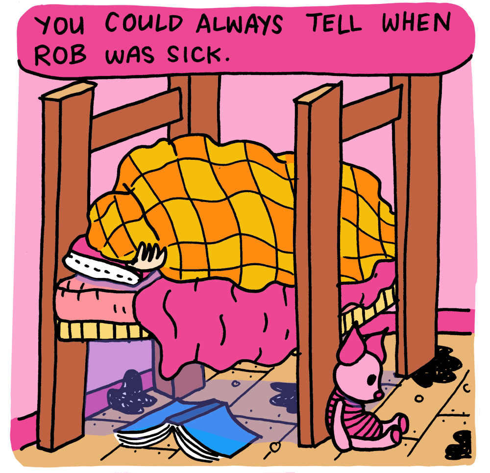
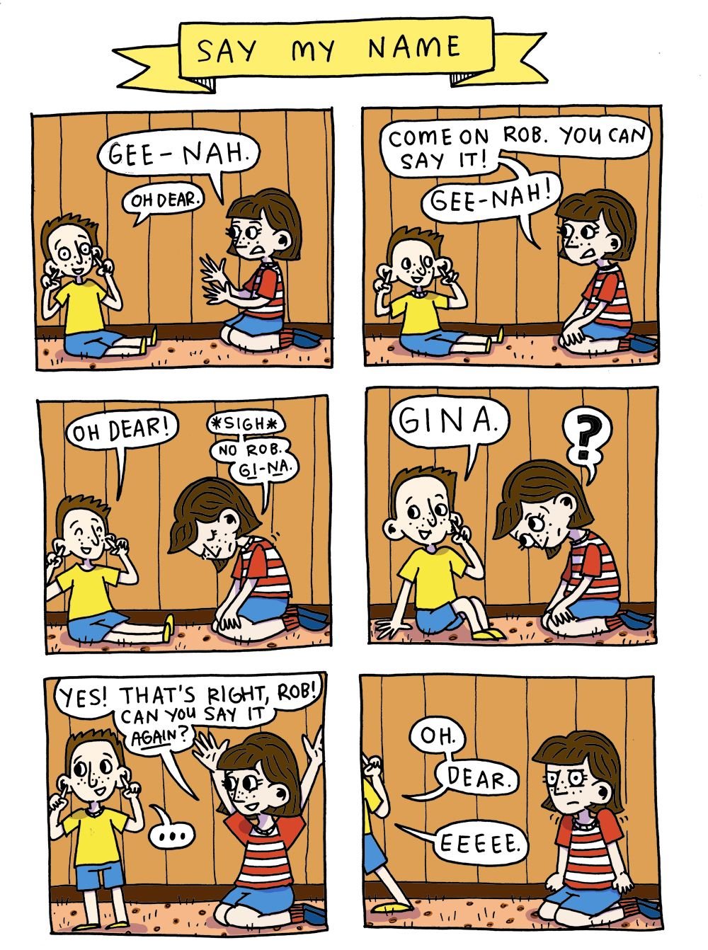
1) Full colour:
And 2) Screen colour:
Full colour is fairly self explanatory but I thought I might break down how the screen style of colouring works because I'm loving the look of it (you may have noticed from my previous posts).
Step 1: Inks.
I draw my inks by hand and fine-liner on paper. Then I scan them in pure B&W and do any clean ups/spell check necessary.
Step 2: Greys.
In Photoshop I add a second layer to the file for the greys. I try to keep the greys palette to a maximum of about 5 shades. I set this layer to 'Multiply'.
Step 3: Colour.
I add a third layer, set to 'Screen'. I turn off the 'Inks' and 'Greys' layers, pick whichever colour I like the look of (in this case a shade of pink) and use the paint bucket tool to fill the entire page with the colour. I turn the other layers back on and hey presto:
Or maybe I should do full colour.
I love the screen effect for my short works but I worry that for the longer book it might be better to use full colour, to keep the readers' eyes engaged with the book.
What are your thoughts? What do you prefer reading, full colour or screen? Do you have any other colour suggestions I could try out?
I hope your day is filled with your favourite colour.
Gx









Following on from my last post about how the design of the characters in my graphic novel, Oh Brother, have changed over the 7-ish years I’ve been working on the book, this post is about my absolute favourite thing: drawing emotions!