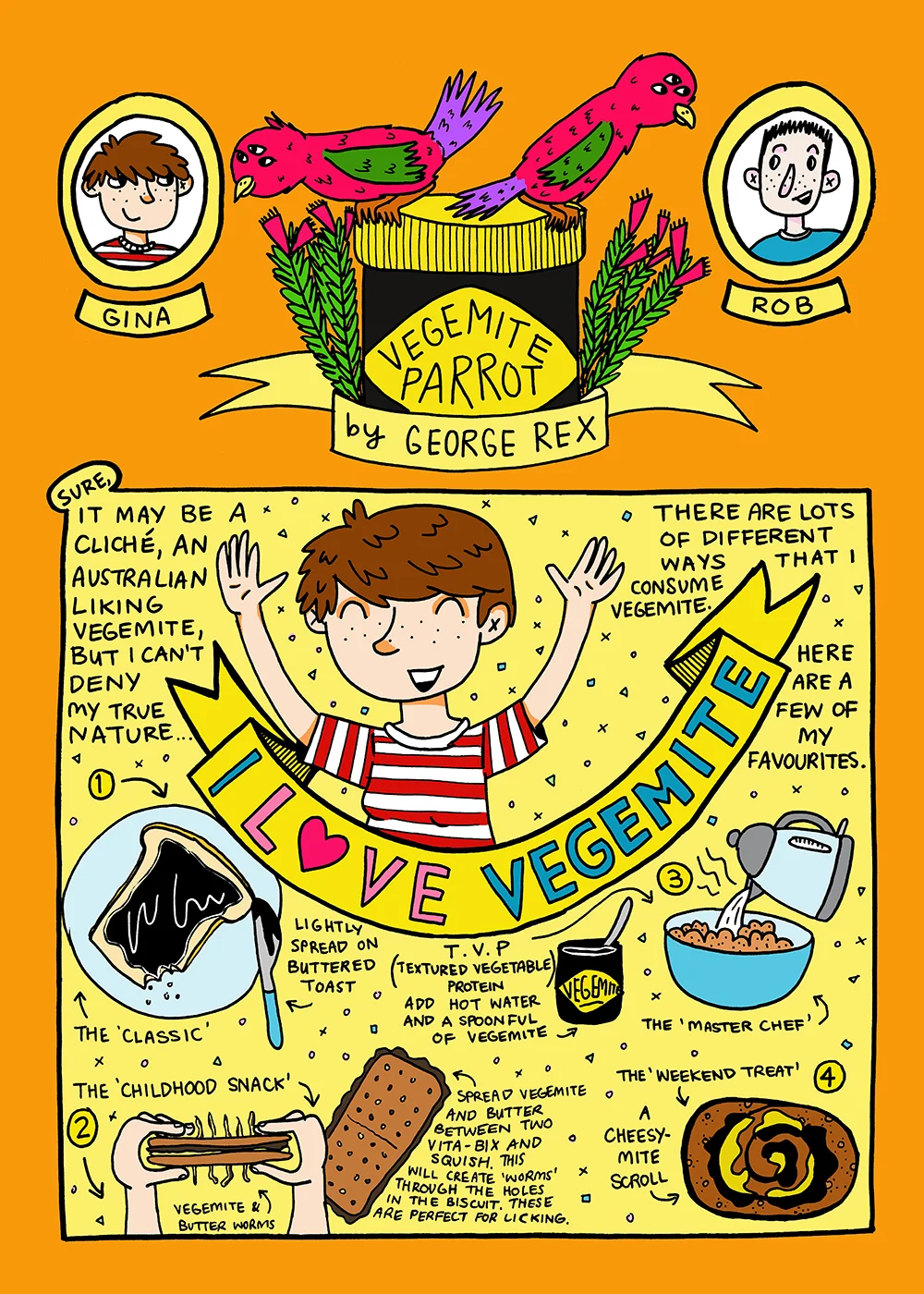
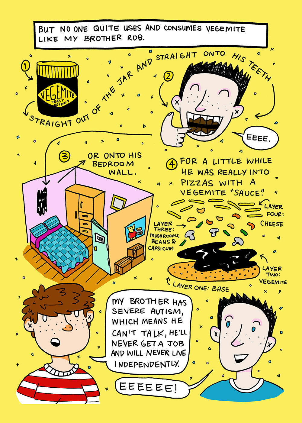
I've been thinking lately about some of the short comics I did about Rob before I made the decision to work on a whole long-form book dedicated to stories about growing up with him. In particular, I've been thinking about one story that I have just revisited in part two: the Tale of the Vegemite Parrot. The first version of Vegemite Parrot was originally published by Comicoz in the anthology Australia! alongside lots of other rad Australian comic artists. And I thought you guys might like to see how my stories and style have changed and what things have stayed the same over the last couple of years.
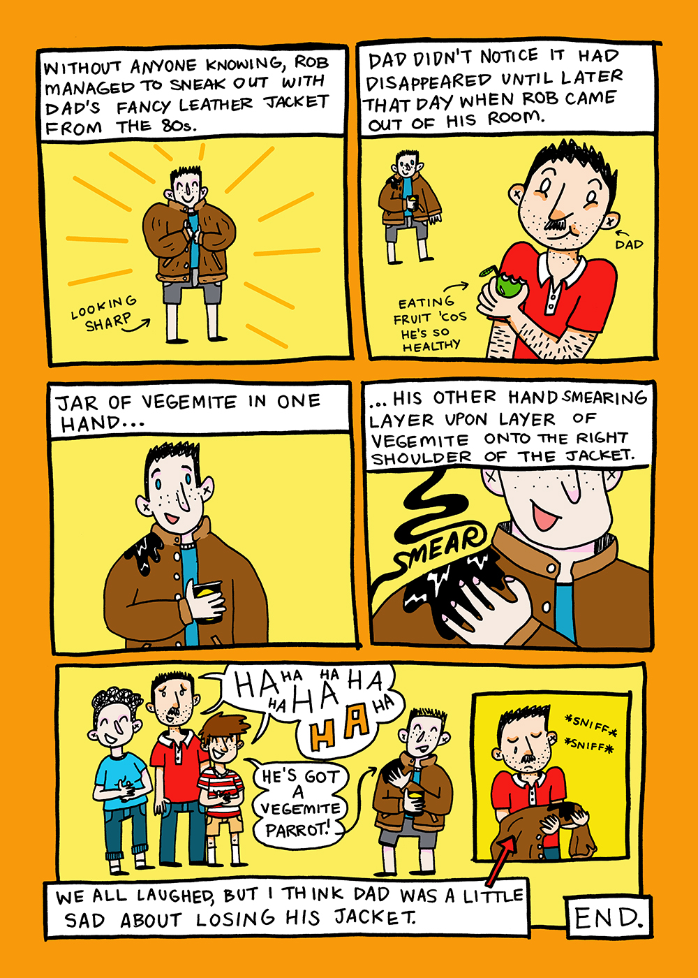
Let's start with my original mini comic. It's a couple of years old now and I've changednot only my haircut, but also how I draw myself and my family members. I have to admit I cringe a little looking at it now but I quite like the 3-eyed parrots (they have no bearing on the story; I just wanted to draw them). Maybe I'll use them in a future fictional story.
Next up we have the process of taking this story and putting it in the middle of a graphic novel. 'Vegemite Parrot' appears in Oh Brother around the 130 page mark and by the time I was writing the script for part two (January/February 2017), I couldn't really remember what I'd written for the first version. I decided to not really refresh myself about what I'd done because I now wanted the story to work as part of the book, not as a stand-alone piece. So without re-reading the short comic, I wrote a brief description about the Vegemite Parrot story.
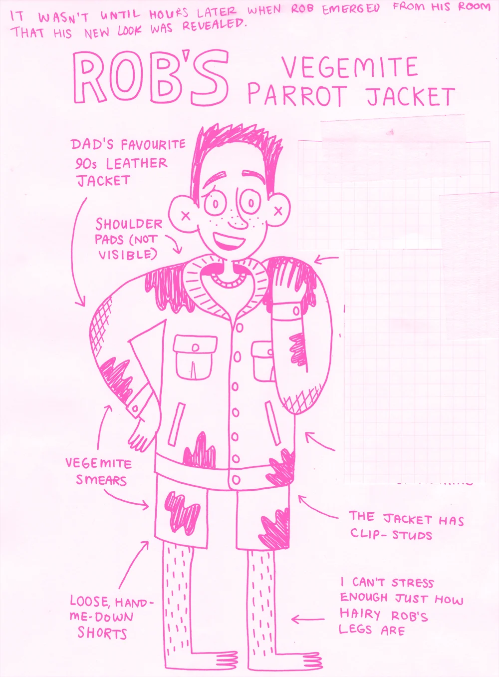
Then came my new favourite part of writing comics: thumbnailing! I took the fairly boring text and added lots of fun pictures to help me visualise what the story would look like on the page. I use red marker because it makes me feel like I'm some sort of fancy editor. I also really like red.
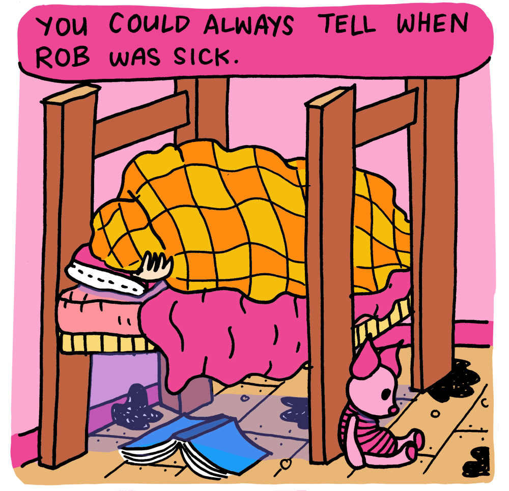
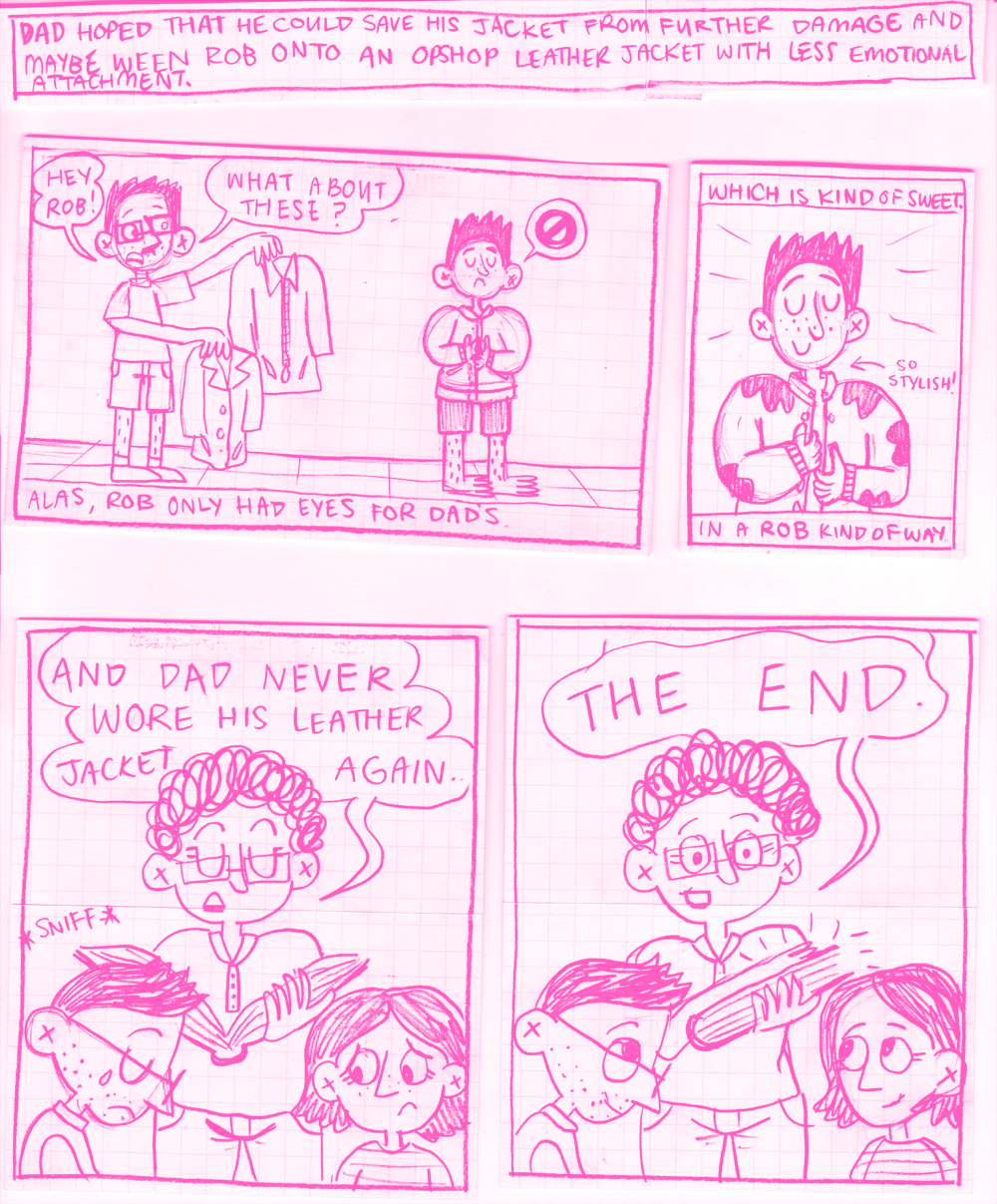
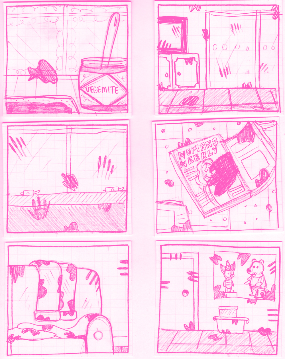
Then came the actual penciling of the story. Now, I figure out the layout for the panels as I'm doing the pencils, because the layout to me is like I'm having a conversation with someone and I want the panels per page to reflect the speed and flow of the story I'm telling. That's why I use gridded paper note cards that are already cut to certain sizes, so I can play around with what the panels will look like on the page before I draw everything up (a trick I picked up from the very clever Pat Grant and adapted slightly for my personal writing style). Note: My pencils are normally a boring grey lead pencil colour. I made them pink for this blog because I wanted to.
The next step is making people read your work, seeing what they think and then editing it again. I've recently had an edit session (I'll talk about that in a future post) and this little story has yet to get a mention (which is good. It means people think it's a good story)!
And that's it! Technically the next step (which I am yet to do) would be to ink and colour the final art of the story but I'm not going to start inking anything until I finish the whole book and have edited it as a whole. I want my inking to be as consistent as possible throughout the book, so doing as much as I can at the same time is my goal.
That's the blog for this week. I hope you found it interesting to re-read my old comic and compare it to the newer version of the story. I find it fascinating seeing what changed and what stayed the same. I didn't much like looking at my old work, but I rarely do. That's why I must always be making more comics, because the next thing will be better. Oh yes.
Have a super week!
Gx
My blog is brought to you by the help of my Patreon Pals. If you want to become a George Rex Patreon Pal, then just jump to my Patreon page here.









Following on from my last post about how the design of the characters in my graphic novel, Oh Brother, have changed over the 7-ish years I’ve been working on the book, this post is about my absolute favourite thing: drawing emotions!